

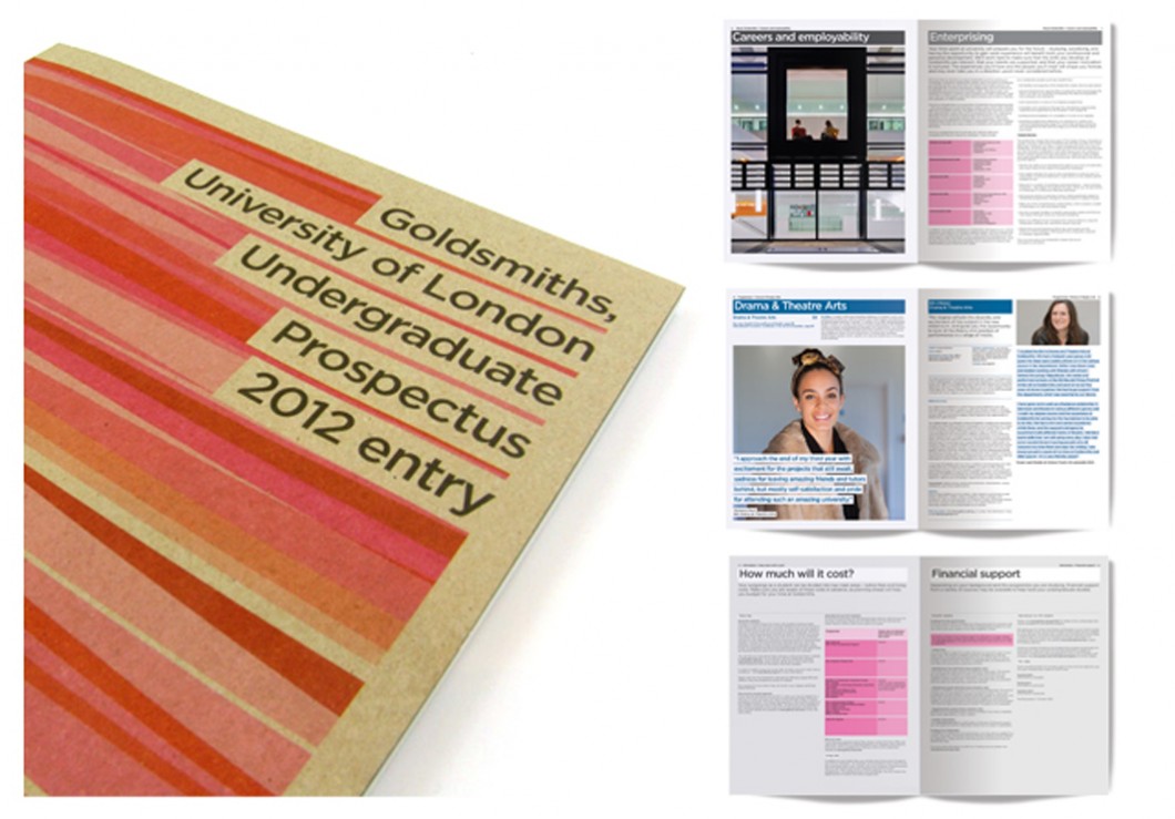
Continuing our ongoing work for Goldsmiths, University of London, we were asked to develop the design and grid further from the original approach we created for the 2009, 2010 and 2011 series, moving forward for 2012 with more compact information and tables to make the brochure work harder with more info over a reduced number of pages, and also to create a new series of covers.
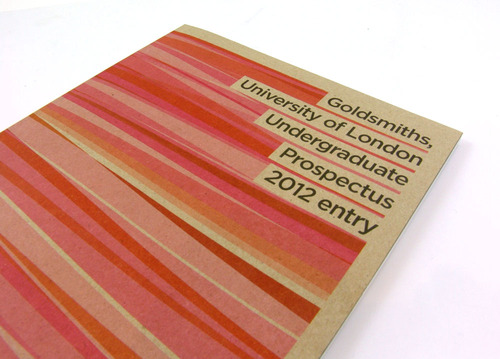
Each prospectus is colour-coded and plays on the blocks of the header bars from the 3 previous years design so that there was a visual connection, which criss-cross over each other in a pattern hinting at connection and exchange of energy.
This series also has an added difference by being printed on tactile recycled brown board, sourced by us at Form.
We’re already on the case with the 2nd brochure in this series which is the PACE prospectus.