One of the most enjoyable parts about being a brand designer is meeting all sorts of interesting people who run interesting businesses and absorbing ourselves in that for the duration of a branding project, and beyond. The more we – as designers and strategists – understand about a client, the more involved and engaged we become, the more relevant and long lasting the results.
When Studio Film School asked us to create a new brand identity we started the process by facilitating what we call a ‘brand bust’. We took the two business directors Donna Bamford and Dan Farrell through a workshop process we have developed to enable us and the client to get to the crux of their brand and their offer. What was immediately evident from this process with Studio Film School was the vast number of tangible benefits they provide for children and their parents through their extra-curricular workshops for children and young people in filmmaking, acting and animation.
Promoting creativity is at the heart of their workshop programme, which encourages children and young people aged 4 – 18 to learn new skills and make new friends. The workshops help to build confidence, develop team work and social skills, and inspire young imaginations. Young people learn about all aspects of filmmaking, producing their own films to share at screening events, online and on DVD to watch at home.
We encouraged a name change and new strap line which was more engaging and which described what they do more succinctly. After settling on the new name Sparks, we set to work on a series of concepts for the logo and visual language.
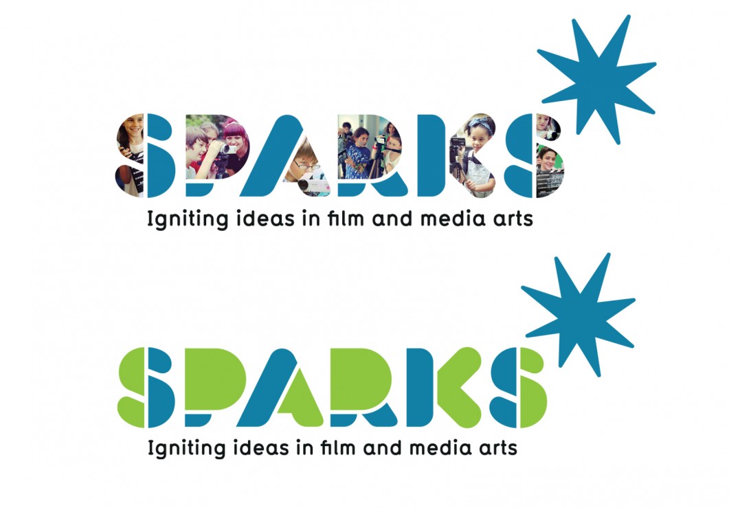
The final logo encapsulates full colour photographic imagery of film making activities within the bold letters, evoking the energy and interaction which takes place in the workshops. It also clearly and instantly communicates what they do and incorporates the new strap line “Igniting ideas in film and media arts”.
For instances when a full colour logo may not be applicable (such as screen printing onto merchandise for example) we developed a secondary logo version with flat colours. Whenever we design a logo here at Form we ensure it is robust and flexible and therefore create and supply assets which will work in colour and mono, in positive and negative as well as on screen and in print.
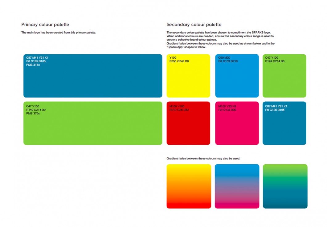
We developed a strong, bright primary colour palette (without pandering to clichéd connotations of “youth”) together with a secondary colour palette and a series of gradients for usage and flexibilty across a wide range of communications.
We also created a series of stand alone Spark graphic shapes with different colour ways for usage across a variety of media such as social media profiles. The client will also use these to segment different ages groups and activities in their communications.

The full style guide outlines our specified typefaces and typographic layouts.
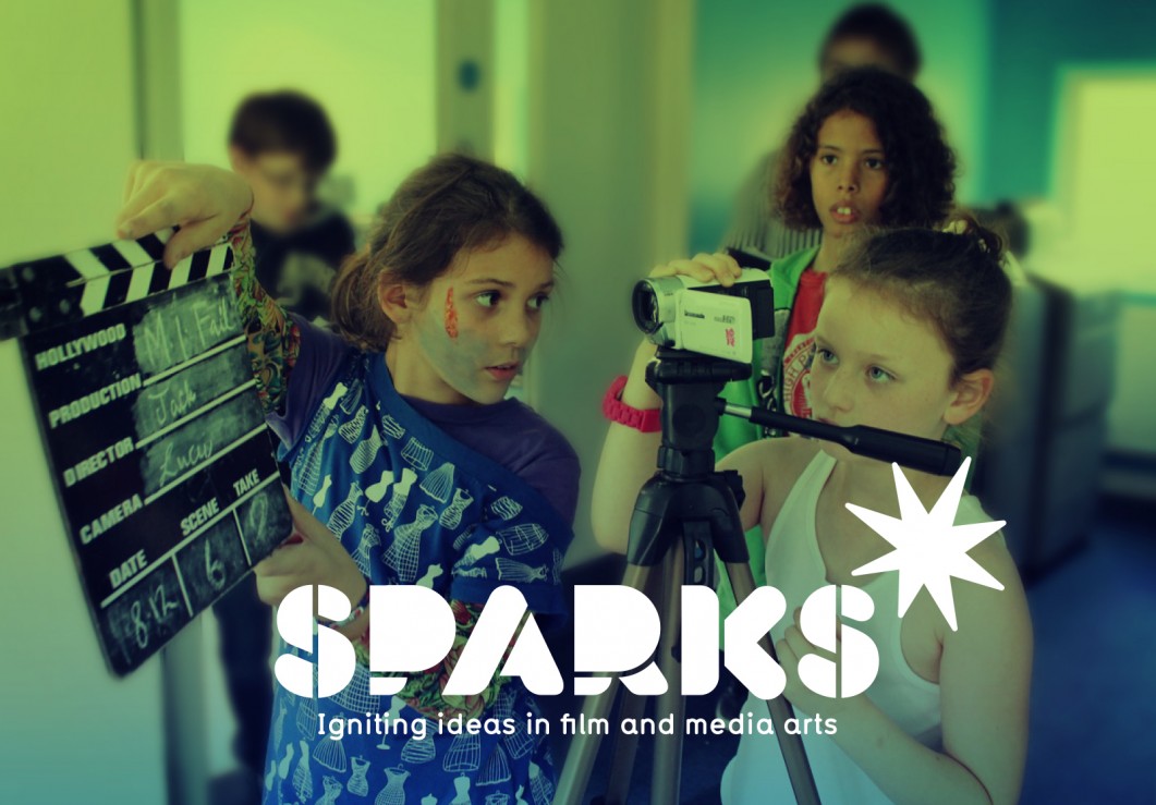
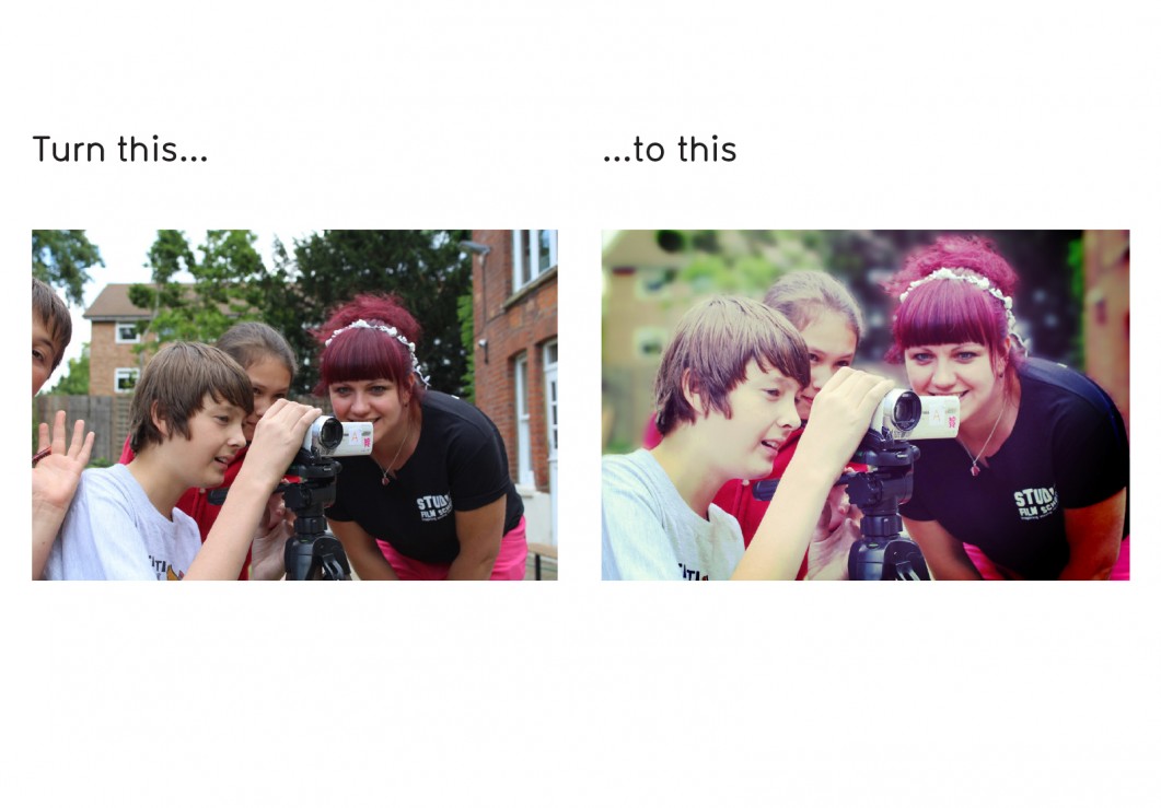
Creating a strong brand identity isn’t just about the logo and the more obvious visual components of the brand. Sometimes it’s more subtle. An important part of our work on the Sparks rebrand was to address the client’s existing, somewhat disparate image library which consisted of varying quality images taken by many different people at different times – a problem we have encountered many times here at Form. We brought these images into a more cohesive set by developing a technique which the client can apply to all existing and future images to add impact and to work more harmoniously together across all communications.
Sparks were thrilled with the results:
“Paul and Paula really took the time to understand us and our vision and helped us pull our ideas together, as well as adding in some incredibly useful objectivity that will really help to inflate our new identity and help take the new brand to much higher level.
They were great at asking the right questions to make us really think about what we wanted to show our audiences as well as helping us think about what our customers want from us and how our business works. We’re really pleased with the new image of our company, and are proud to have some brilliant artwork to show off.
We can’t wait to roll it out! For us as a small business, it sometimes feels like handing over a baby but we felt a sense of trust working with them that helped to open us up to new ideas and possibilities. If we could, we’d have them on the payroll!”