

We were invited to work on the rebrand of Strictly Rhythm, regarded as House music’s most influential label.
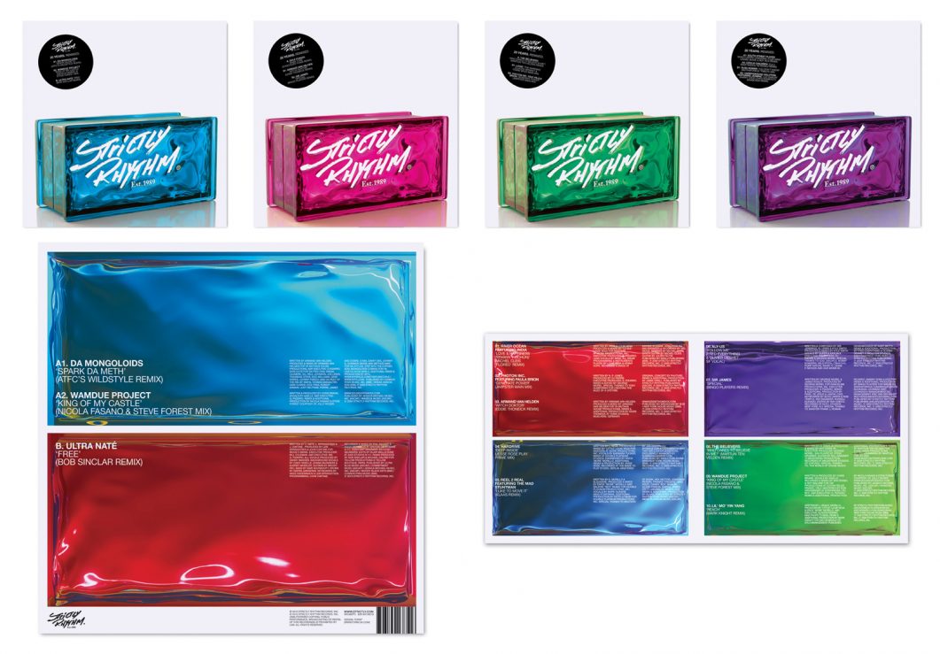
Strictly Rhythm EPs, album back cover and booklet spread
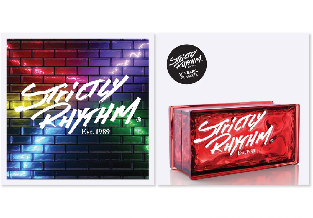
We proposed a 21st Century take on the original ‘brick wall’ identity, by developing a glass brick wall, flooded with ambient lighting (moving away from the original graffiti, New York-dominated creative associated with the label).
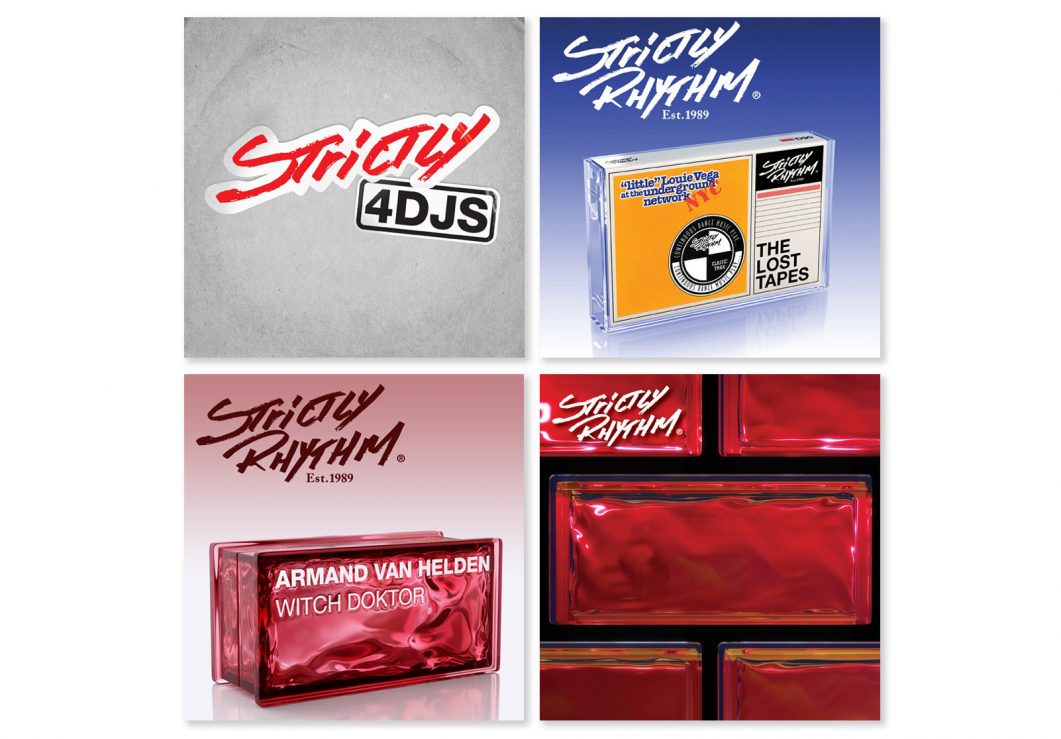
Strictly Rhythm alternative commercial and promo releases
The rebrand generated renewed interest in Strictly Rhythm, allowing them to reach a new market (unaware of the label’s musical heritage) while retaining the integrity of the brand.

Strictly Rhythm Web design
What really excited the client about the glass wall concept was the idea of the singular brick becoming ametaphor for the individual tracks that came together to build the ‘House that Strictly Rhythm built’.
The logo and typography were rendered onto the 3D brick and changed for each release.