The USA’s professional association for design, AIGA recently published an interesting and in-depth piece in Eye On Design on the ins and outs of design and branding festivals.
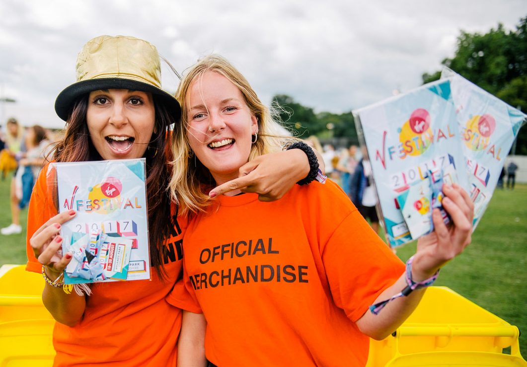
In the article “What Does it Really Mean to “Brand” a Festival?” Fyre festival gets a rightful roasting for it’s total fiasco leading to the organisers being charged with fraud, the ‘anti-branding’ of Glastonbury is also discussed and Form’s Paul West talks about our own approach to festival branding, having created rebrands for Reading and Leeds Festivals, Latitude and Virgin V Festival.
Here’s a snippet:
“London-based studio Form has a long history of working with music clients, having spent the last two decades working on projects for the likes of Elbow, Scritti Politti, Depeche Mode, Ministry of Sound and Girls Aloud.
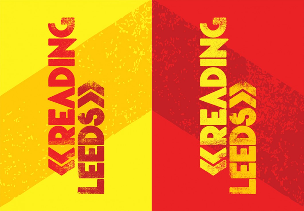
Over the past few years the agency has also undertaken some major rebrands for some of the UK’s largest and most established festivals: Reading and Leeds, Latitude, and V Festival. The first of these was in 2012 with the creation of a bold new look for Reading and Leeds Festivals.
 Form’s involvement started after Melvin Benn of Festival Republic (the owners and co-produce Reading, Leeds, Latitude, Wireless, and Download festivals) invited them in for a meeting. “We got on really well,” says Form co-founder Paul West. “I’ve got huge admiration [for Benn], he always briefs face to face and we enjoy those conversations, and we bonded through that and our shared passion for music.”
The key to our approach for Reading and Leeds was simply to celebrate the festivals themselves. “They’re world-famous events, so we didn’t want to put anything too hooky in it for the visuals,” says West. “ we colour coordinated bold colour; Reading as red with Leeds as yellow, and that worked fantastically, from posters to the stage scrims in their full bleed colour. The rebrand really took off from celebrating the greatness of the Festivals.”
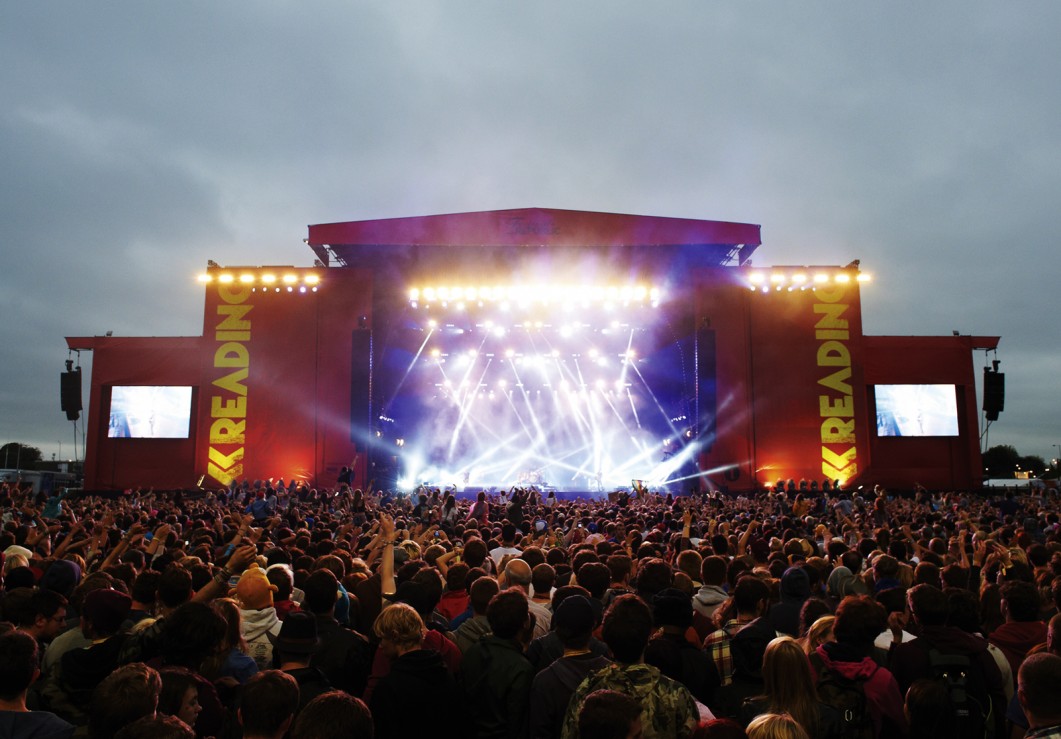 The colours were chosen for their ability to stand out, “when we looked at festival branding around the world, there weren’t many that relied on vivid colors.
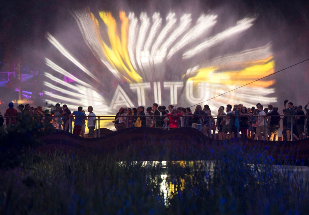
In 2014 Form was brought in to create a new look for UK festival of music and literature, Latitude. “We were massive fans of the festival and had been going for quite a few years” says West. “We felt we really understood the festival and loved the fact that it was about music, art, literature, watching the sunset over the lake and discovering a rave in the forest at night.”
 The designs drew on the spectacularly beautiful festival setting by the lakes and forests of Henham Park, near Southwold, Suffolk. “We just wanted to celebrate the beauty of the festival,” says West. “We used a decorative font for the logo but wanted to keep it tight and graphic. The logo incorporates a keyline diamond graphic, which is an interpretation of a compass, so playing on the idea of latitude.”
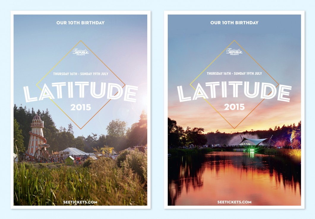 Form then went to the festival site a week before it opened and then captured the whole festival with photographer Peter Beavis throughout the day and night, and used the resulting imagery to create “a whole canon of really amazing images,” says West.
 Virgin’s V festival brought in Form to work on its 2017 branding last year. Form commissioned signwriter and artist Archie Proudfoot to collaborate on creating a new type-based identity for the festival. “One thing we loved was the idea of slightly carnivalesque typography, and letting the typeface do the talking without having to rely too much on festival photography,” says West.
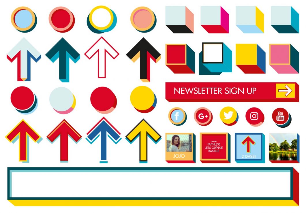
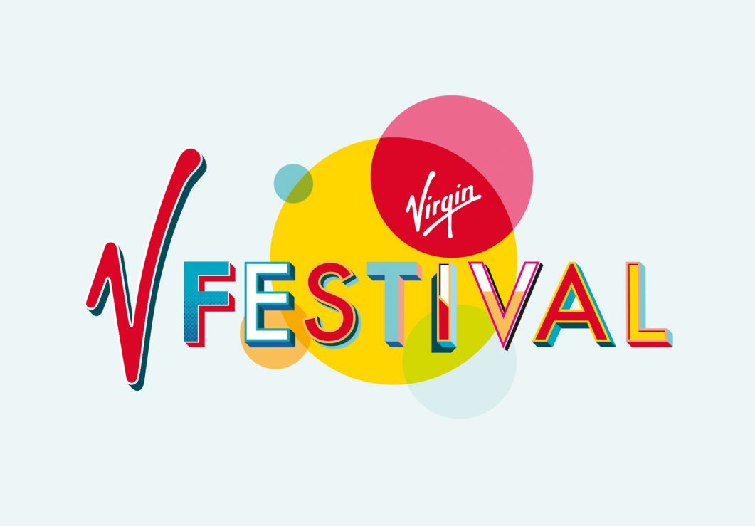 Together, they created an entire V alphabet, including “hashtags, commas, and ones to zeros”, which was given to the Festival Republic team to apply across various festival marketing communications. This was part of the “extensive style guide” Form created to ensure its designs were translated into a consistent look and feel that would work over future years.
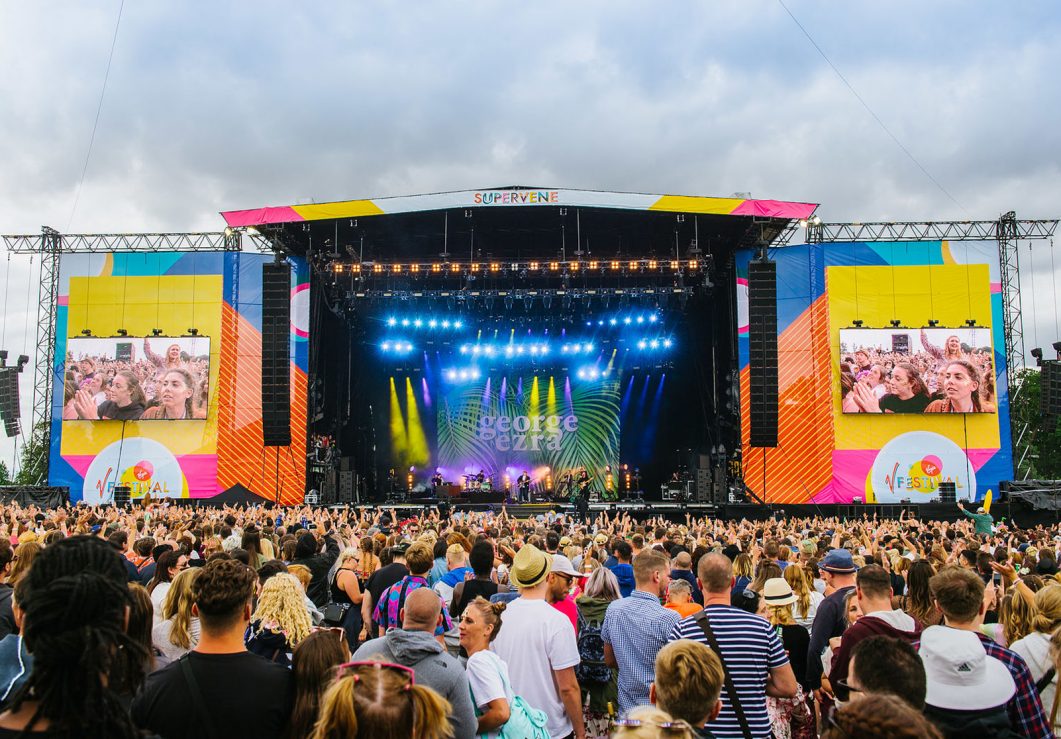 “For us the Festival is about the emotional experience of the event, and that’s what we’re trying to channel with the designs.”
West says that rather than focusing on the minutiae, festival designs are more about drilling down into the less tangible things that people love about them. “There’s an awful lot of effort put into the festival tone of voice—each one is trying to distinguish themselves from one another. A festival is essentially an outdoor space—a field or a glade or lake or forest in nature—what can you do to make that distinction? That’s what we love to create”.
Read the full article on Eye on Design here