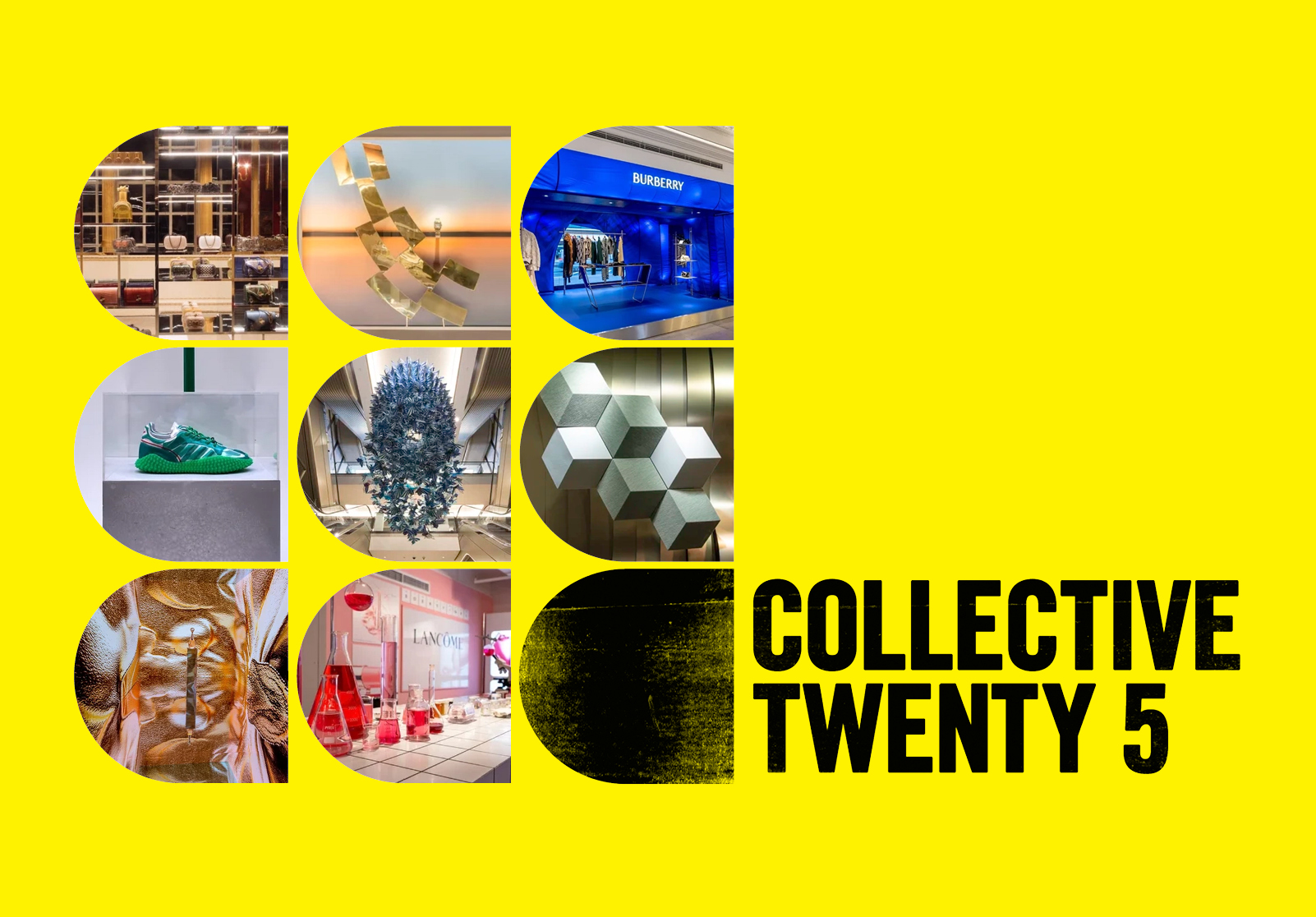

Collective Twenty 5 commissioned us to create a complete brand identity: logo, website, digital assets, social templates, tone of voice, and style guide, built to give the brand authority, consistency, and a clear point of view.
The agency creates physical brand experiences that connect people, products, and space. Working across concept, design, production, and manufacture, they specialise in retail visual merchandising and three-dimensional brand activations: windows, pop-ups, and immersive environments built with specialist fabricators and supply partners. Their clients in the luxury sector including Mulberry, Dior, Lancôme, DAKS, Charlotte Tilbury, adidas, and Wedgwood.
Having recently relaunched under a new name, the studio needed an identity that reflected the quality and depth of its output. One that carried weight, communicated craft and experience, and held its own in a sector with no shortage of visual noise.
We are living through a period of digital saturation. The growth of AI and the flattening effect of social media have begun to erode tangible connection, producing work that is in danger of looking increasingly similar.
The luxury sector understands this shift more than most.
Collective Twenty 5 operates in the space that digital cannot occupy. Their work is spatial, tactile, and three-dimensional: physical interpretations of luxury brand identity and intent, built for clients who understand that craft and presence create a quality of connection that screen-based communication cannot replicate.
The task was to build a brand identity that reflects this clearly: one that communicates the depth of craft behind the work, positions Collective Twenty 5 with authority within the luxury sector, and gives the company a confident foundation to grow from.
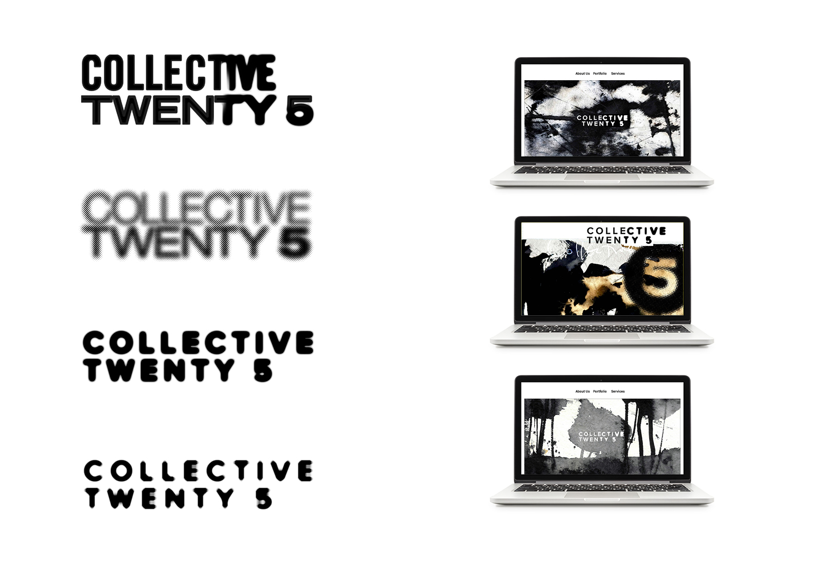
We began by developing several distinct strategic and visual directions, each representing a genuinely different interpretation of the brief. Presenting multiple routes opened up discussion and let the strongest solution emerge through collaboration.
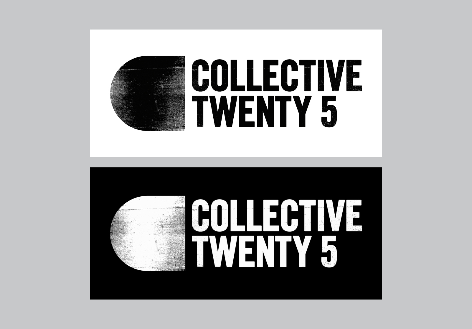
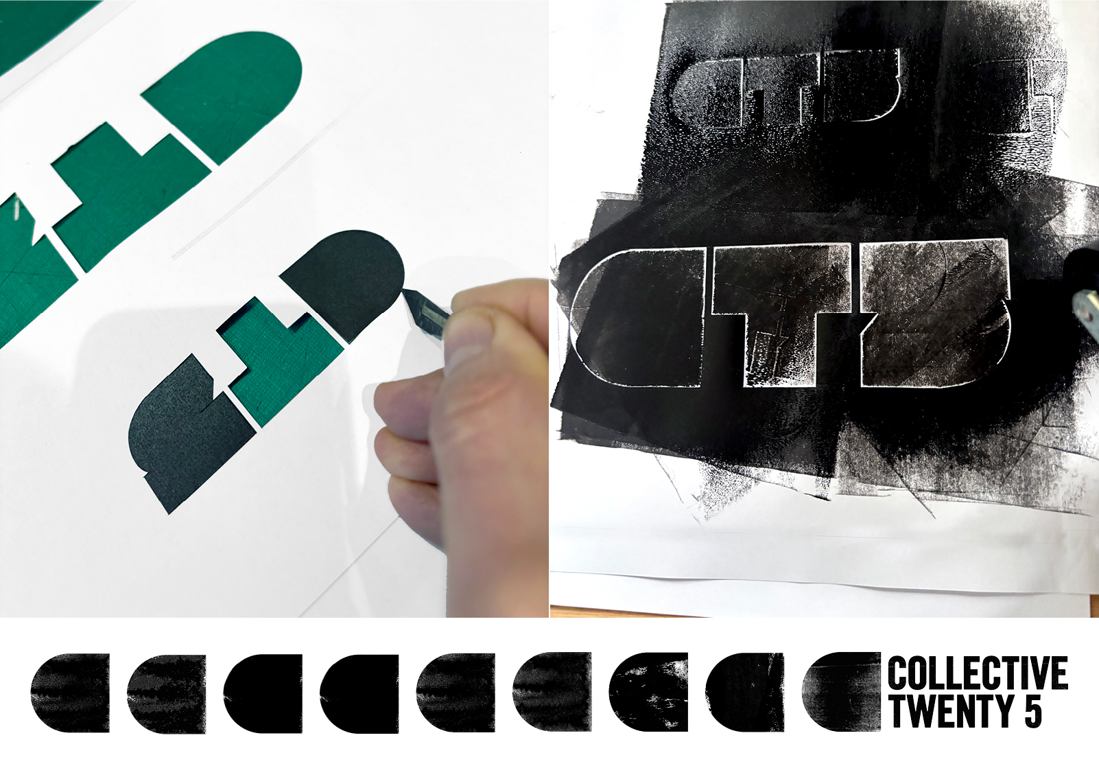
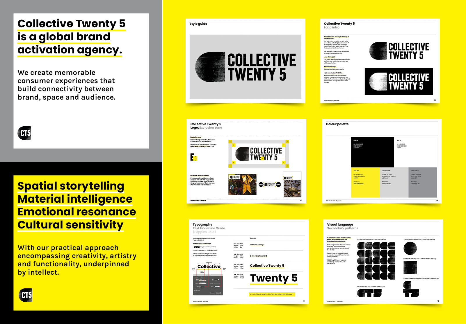
For the logo design we moved away from the digital vector approach, creating the texture by rolling ink and scanning the result. Gritty-analogue, the final mark carries the raw energy of a photocopied fanzine. We customised the logotype further, reshaping and personalising the letterforms specifically for Collective Twenty 5. A subtle punk influence runs through it: authenticity and attention to texture over digital perfection. We are confident the logo doesn’t just represent the company. It demonstrates the way the company thinks and works.
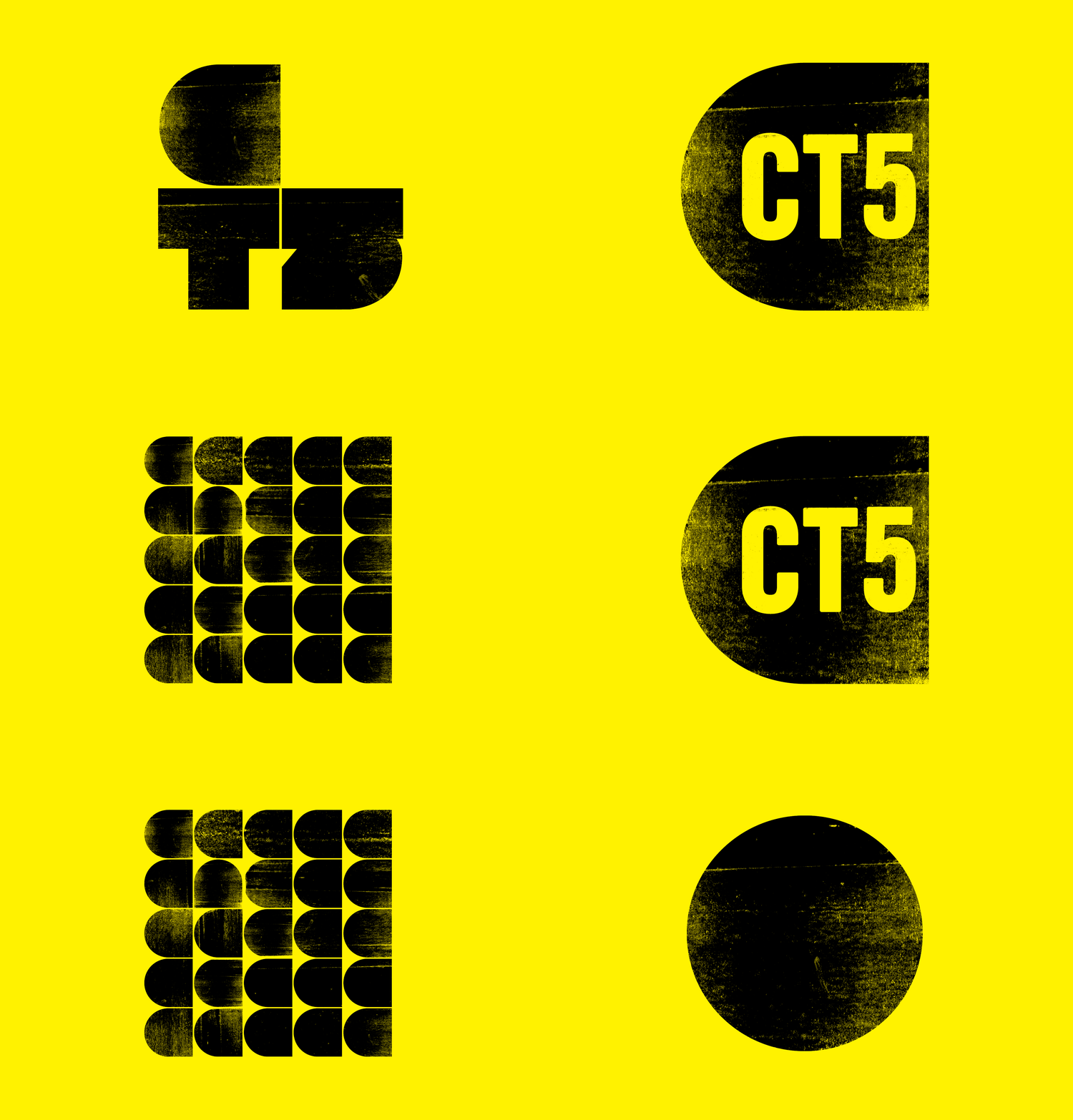
The C—mark acts as a container, housing textures, imagery, and project work within its shape. Used in repeat it creates a distinctive, modular visual language. The work sits inside the brand: a direct metaphor for everything Collective Twenty 5 makes.
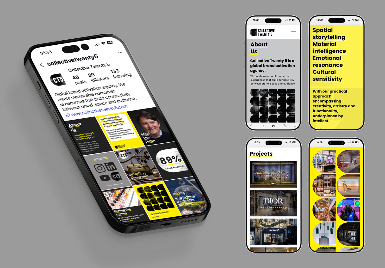
Alongside the primary mark, we created a shorthand CT5 logo set within the C—mark, it works effectively as a compact, recognisable identifier across Instagram, LinkedIn, and Pinterest, where brand clarity at smaller scale really matters.
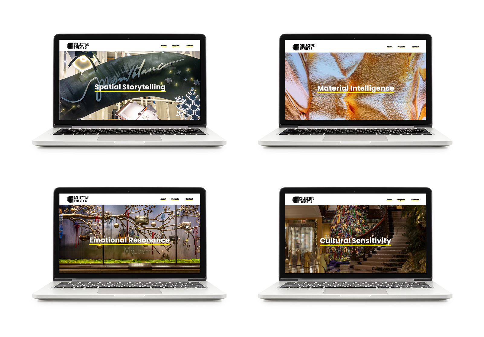
From there we built the full brand system: logo suite, colour palette, typefaces, texture library, social templates, website design, and a style guide to maintain consistency as the brand grows. We also developed a tone of voice that is direct, confident, and free of jargon.
The Collective Twenty 5 identity is a considered but adaptable system. The style guide keeps every touchpoint consistent, whether the brand is being applied internally or by external designers, suppliers, and partners. Logo, colour, typography, and layout each play a defined role in building a coherent brand presence over time.
The aim was not just to create something visually striking. It was to build an identity with enough depth and clarity to grow alongside the company itself.