Form® partners Paul West and Paula Benson have rebranded the Women in Tech World Series and their five global events (Women of Silicon Roundabout, Women of Silicon Valley, Women in Tech Texas, European Women in Tech and Women in Tech Boston) resulting in a lyrical, colourful and ‘non-techie’ identity to strengthen the brand’s position as the leading platform to empower women working in technology.
Organised by Ascend Global Media, the Women in Tech World Series has global reach. Their brief requested that the World Series parent brand and their series of five events become part of the same family, stand out from global competitors and feel gender neutral.
The events provide a platform for energising women working in technology to connect, learn, and to feel empowered to progress in their careers. The events attract individuals and organisations from across the globe and unite outstanding speakers, thought-leaders and experts, alongside unrivalled networking opportunities, to deliver a powerful experience for those working in and involved with technology.
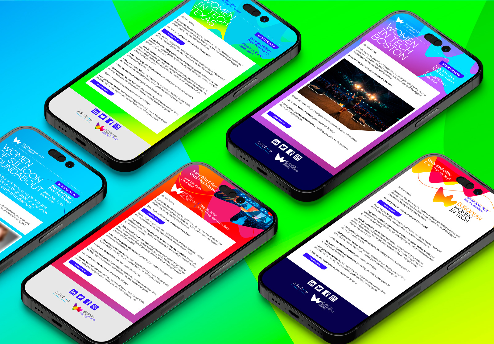
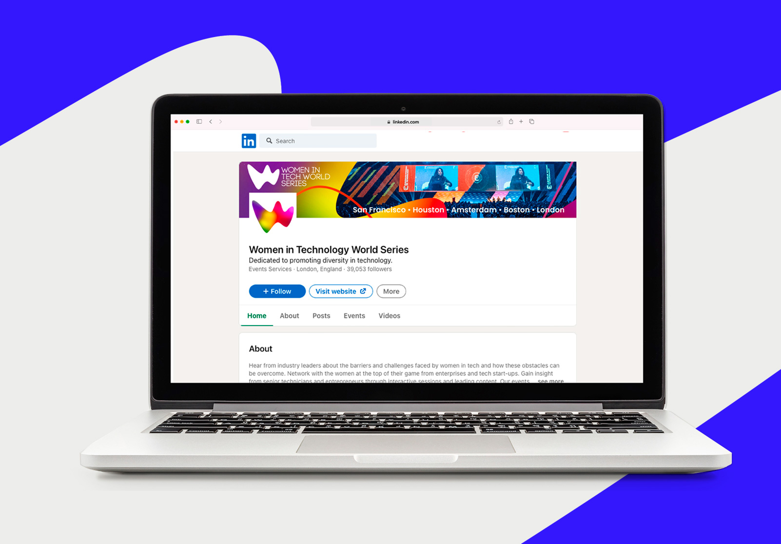
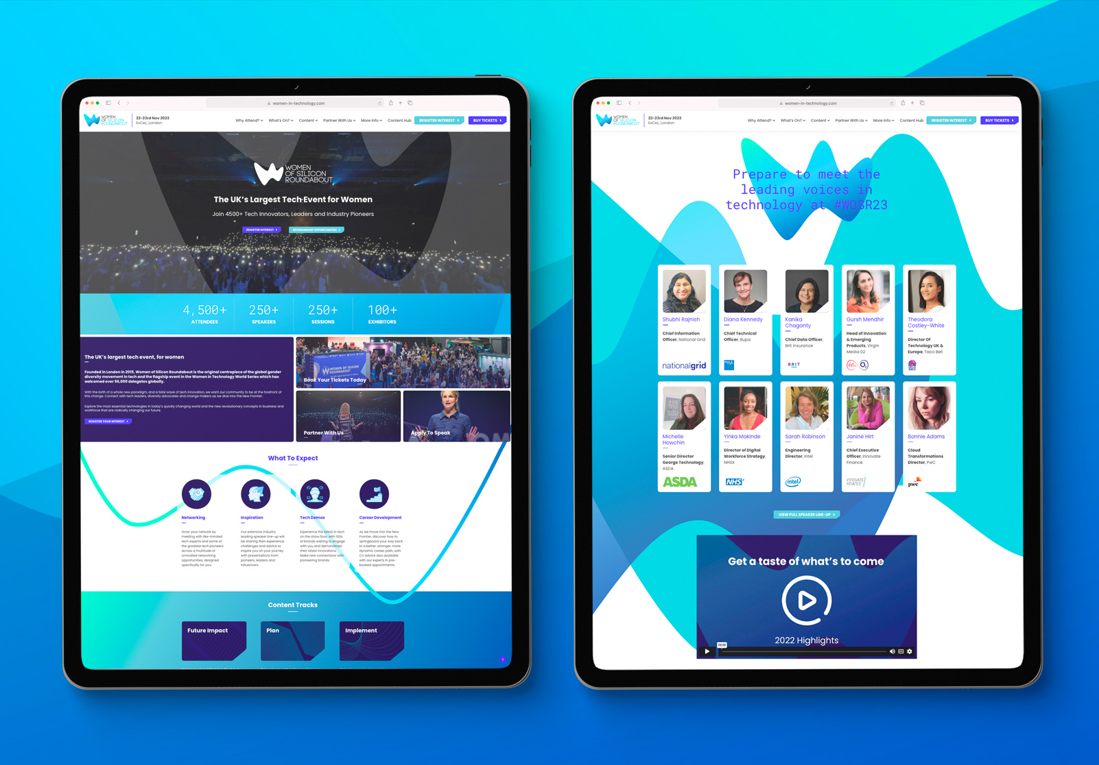
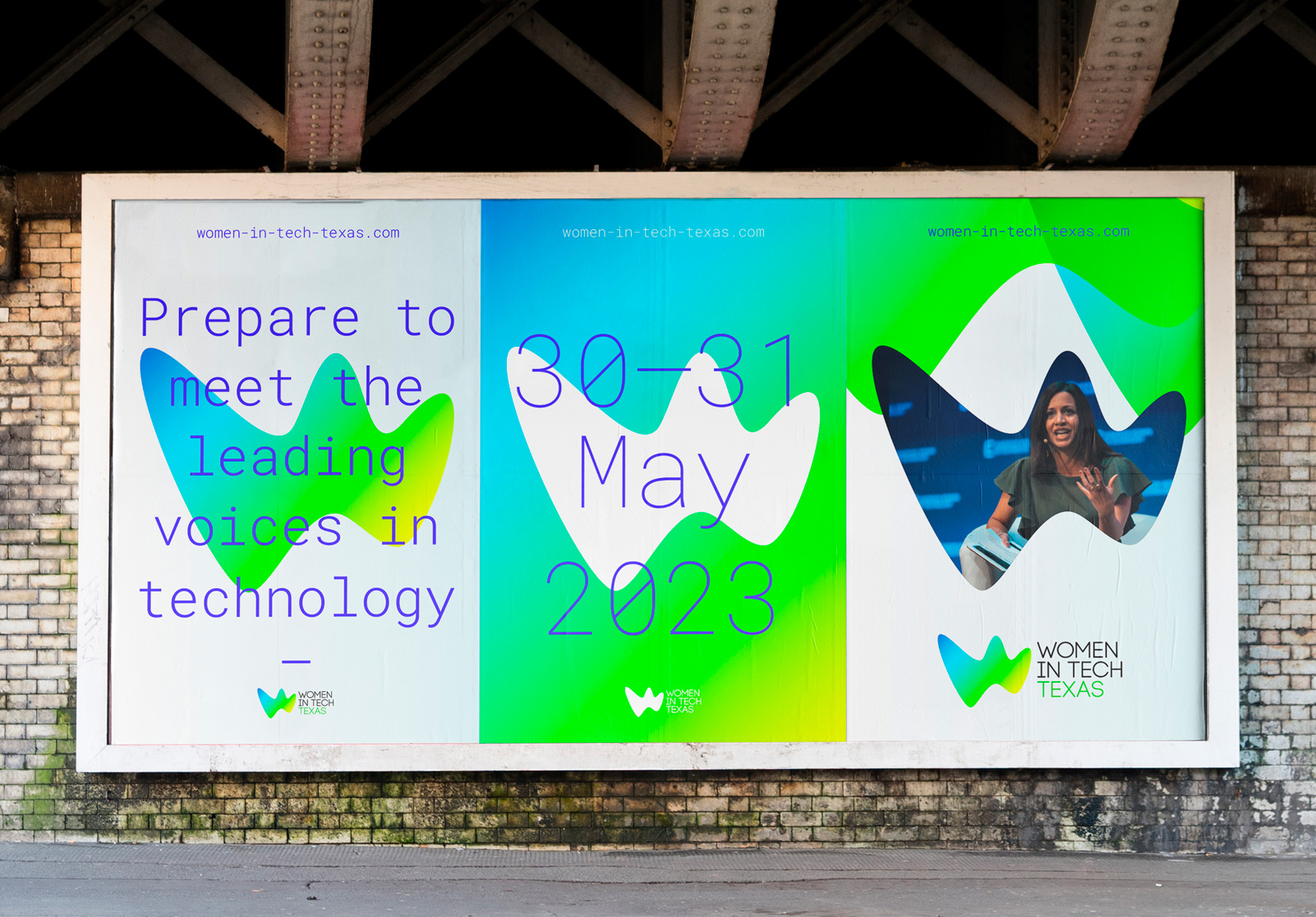
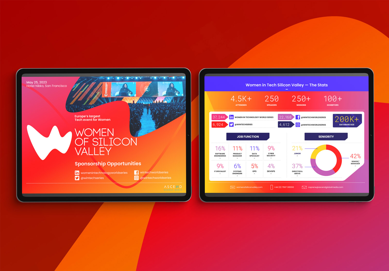
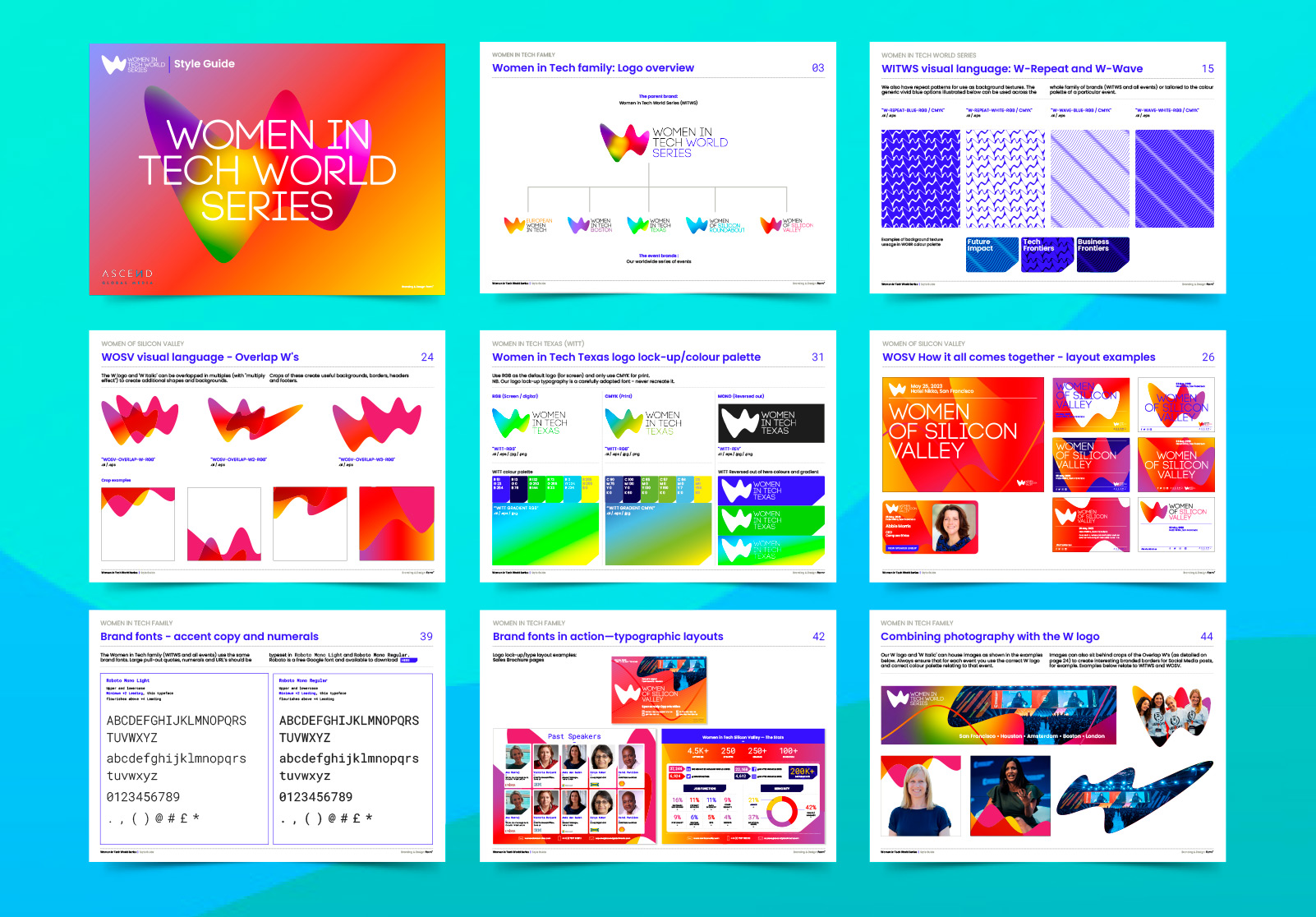
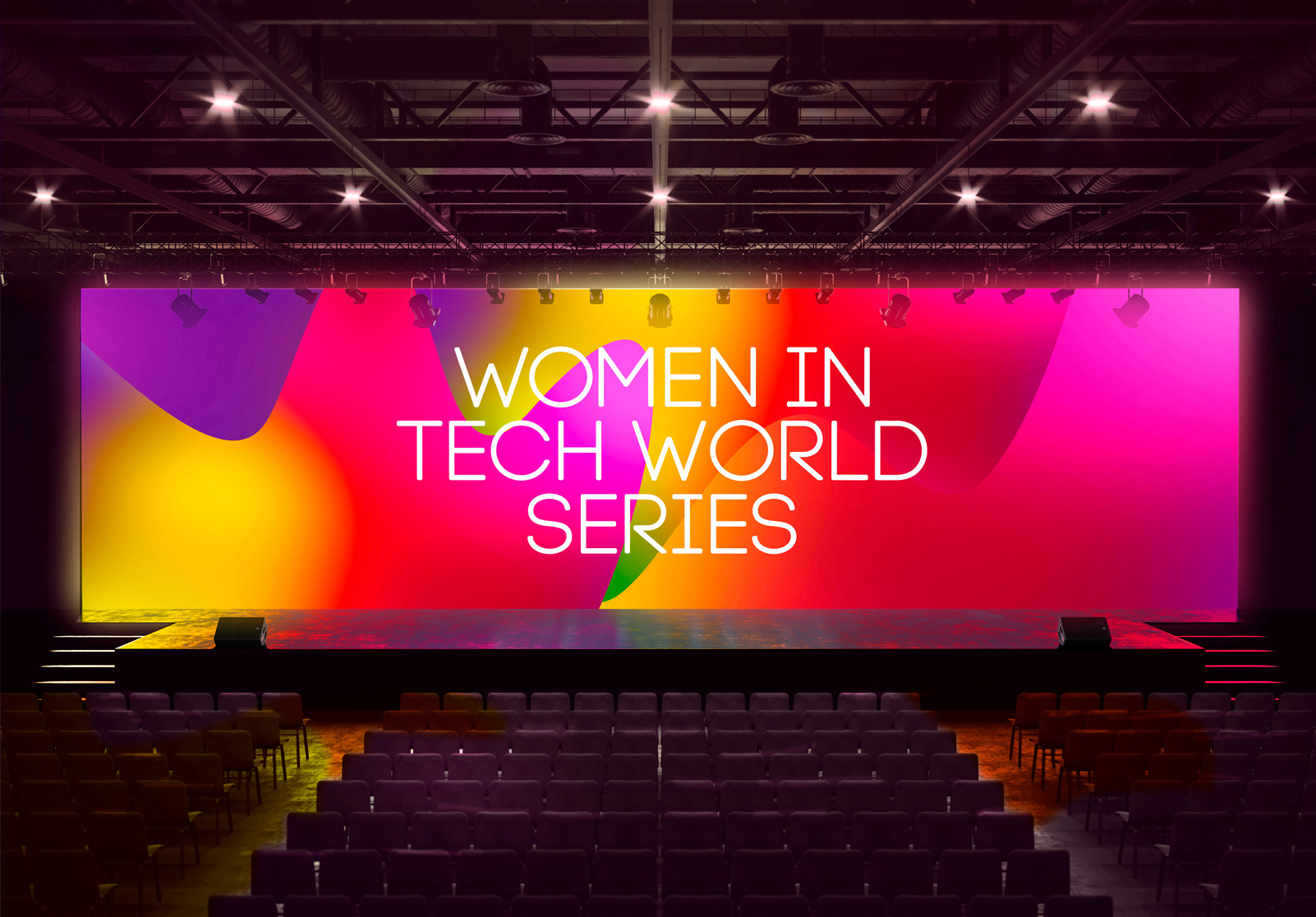
We have created a new suite of logos and visual identities for the World Series parent brand and five events, together with a comprehensive style guide, website homepage and key creative assets such as onsite event banners and screen graphics, sales brochure template, a set of email templates and Social Media header banners, shorthand profile logos and in-post templates.
To capture the energy that is created in bringing together people who drive progress in tech, we created a striking visual language that is celebratory and stands apart from the typical B2B conference and tradeshow. Our aim was to create an identity that feels more ‘festival’ than ‘work conference’.
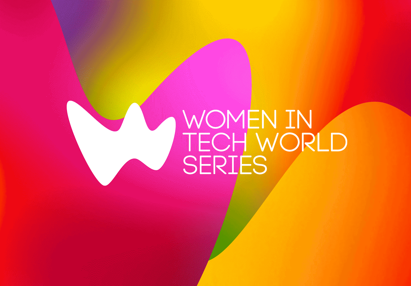
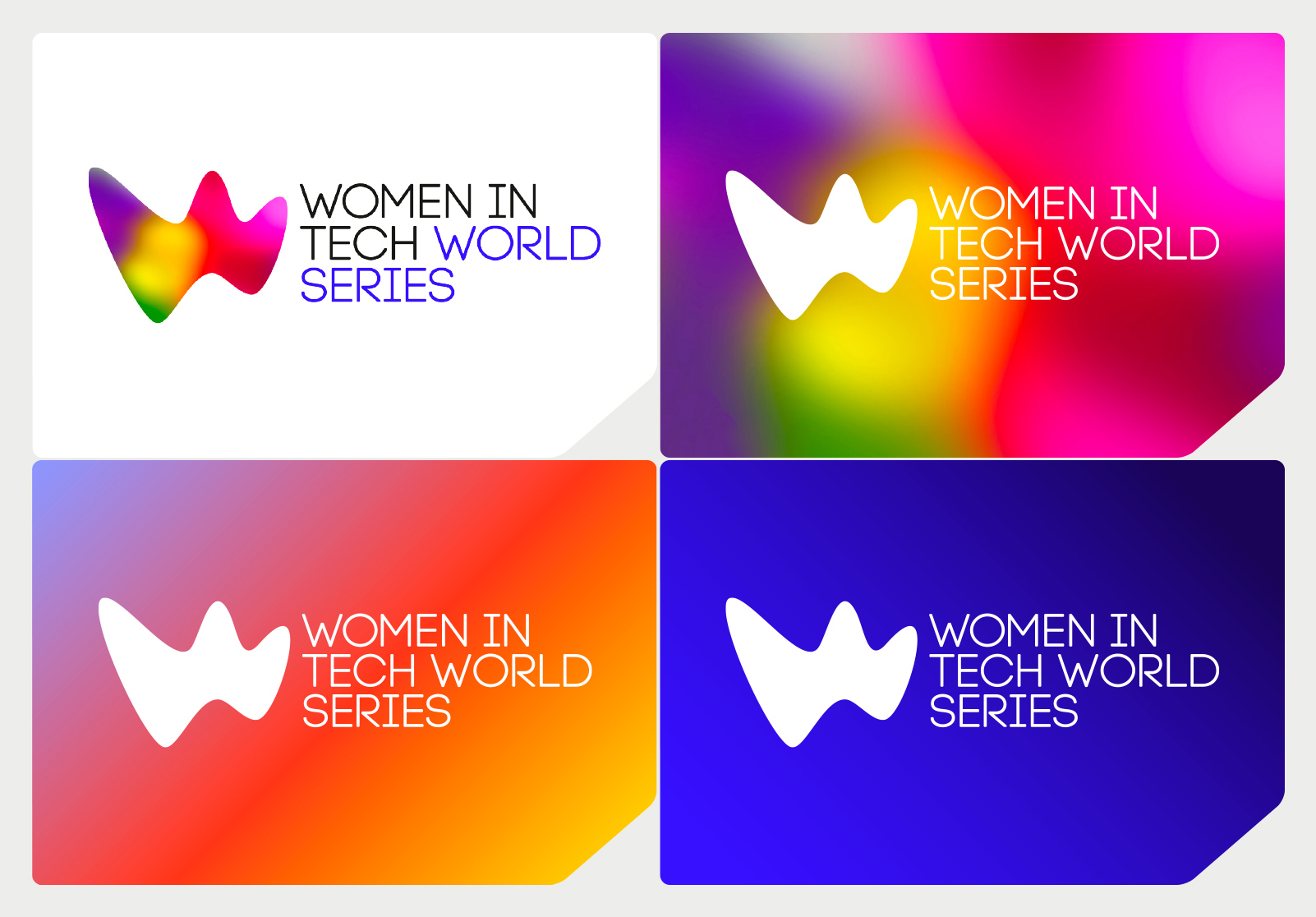
The hero of the identity is the vibrant ‘W’ logo – shorthand for ‘Women in Tech’ – reflecting the concept that the tech industry is always evolving and innovating, while the lyrical, organic shape of the ‘W’ avoids the visual clichés so often associated with ‘tech’. This over-arching concept (which informed the logo design and entire visual language) we termed ‘Tech Organic’.
The result is an identity that feels upbeat, open and welcoming yet also communicates a sense of gravitas.
The details
The ‘W’ logo sits with clean, modernist ‘Women in Tech World Series’ typography to form a series of logo lock-ups.
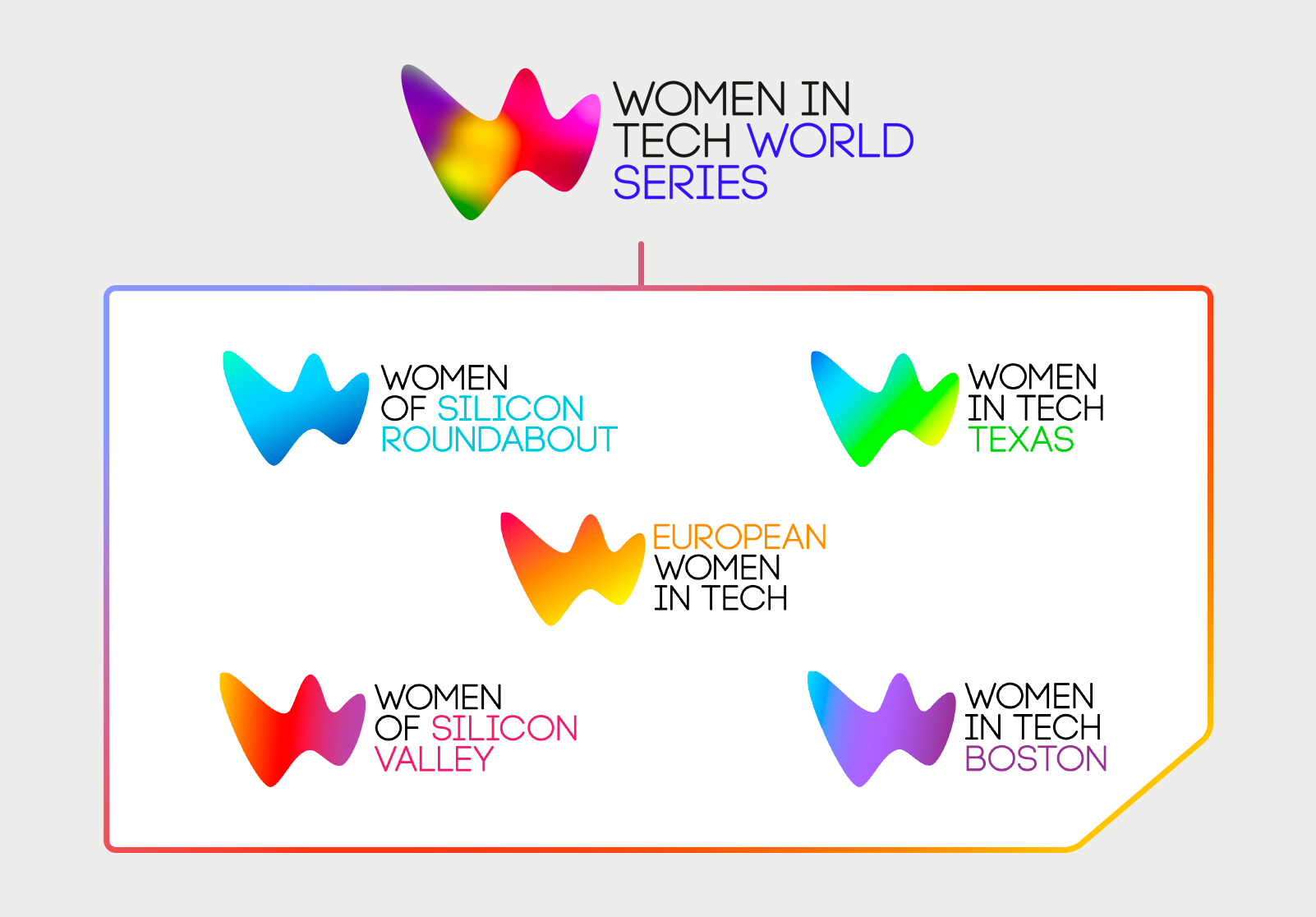
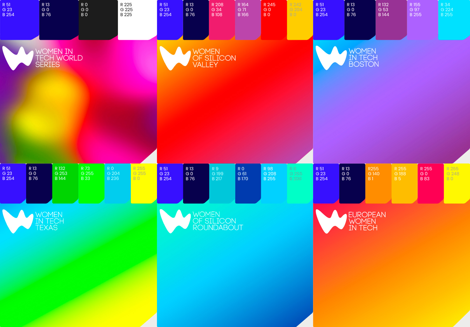
The series of five event logos all utilise the same Women in Tech World Series parent brand ‘W’ logo shape, yet each event has its own individual colour palette, and is accompanied by its relevant logotype. The colour palettes of all the individual events unite under one colourful kaleidoscopic parent brand World Series ‘W’ logo and accompanying graphics, representing that fact that the World Series is the overarching brand of all the separate events.
The versatility in the ‘W’ logos (and variations thereof) allow for overlaps in multiples, to create a myriad of dynamic shapes and backgrounds which are incorporated into many of the touch points across the rebrand. Additionally, the ‘Connector Thread’ graphic represents the idea that Women in Tech events connect people and ideas.
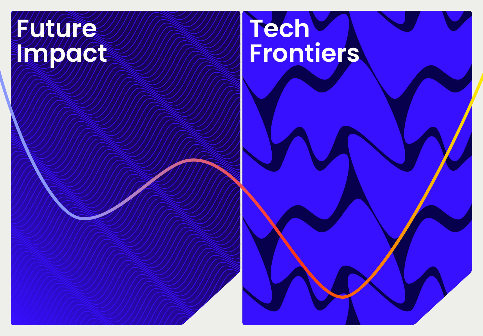
A series of repeat patterns based on the logo shape have also been created for use in all marketing materials including event zone logos and the website, and are adaptable to clearly distinguish each particular event.
The ‘W’ logo (and an italic version of the hero ‘W’ logo) also encapsulates live event photography as a metaphor for the ‘W’ as the home of the event.
We introduced two new fonts to be synonymous with the Women in Tech family: Poppins and Roboto Mono. Poppins is a geometric sans serif and brings an international stance to a global identity. Roboto Mono beings a hint of tech to the table – both in its aesthetics and in its creation, originally developed by Google as the system font for its mobile operating system Android.
Client feedback
“It was a great journey from start to finish working with Paula and Paul at Form®. From the initial brand bust meeting to the creation of the strong Women in Tech World Series identity. At the initial meeting we knew we were dealing with a highly creative, professional, respected, and knowledgeable design studio. Both Paula and Paul are fantastic, ‘true’ artists, with excellent organisation and presentation skills. We had many iterations to get to the finished piece, and they took all feedback in their stride and kept taking the project to the next level. Ideas kept coming throughout the process and we really felt they were part of our team. The brand has surpassed all our expectations and has a lot of growth capabilities, and we couldn’t be happier with the result. Thank you guys!” James Bisset, Head of Marketing, Ascend Global Media.