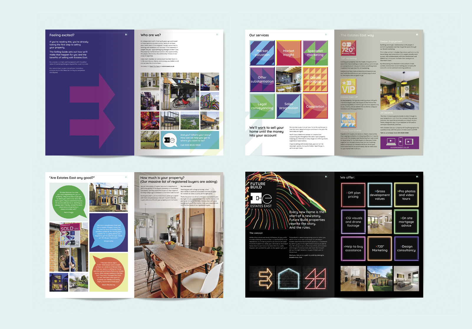
Our rebrand of east London estate agencies Estates 17, Estates 7 and Estates 10 has included brand strategy, naming and design of the visual identity consisting of logo design, typography, colour palette and copywriting tone of voice, together with the redesign of the Walthamstow head office, website and all communications and marketing materials – from print and digital, to Out-of-Home advertising and social media.
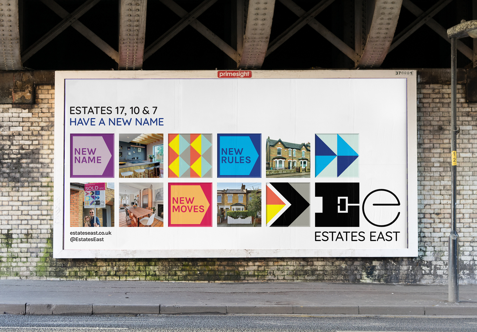
The new name ‘Estates East’ unites the three east London branches in one cohesive brand and was proposed after we conducted a “Form Brand Bust” workshop and brand hierarchy analysis.
The new brand strategy and visual identity reflects the creative, vibrant, diverse and ever-evolving spirit of east London and puts people and stories at the heart of its brand positioning, enabling Estates East to achieve its goals: To appeal to the local area’s changing demographic, to reflect the company’s new young team and to be better positioned to increase market share.
The bold, colourful rebrand also expresses the client’s ambition to change the rulebook on estate agency: As founder Neil Collins and his team talked about the messages they wanted to convey, we quickly realised this project was more than a visual rebrand, it was a manifesto that riled against every cliche about corporate estate agency.
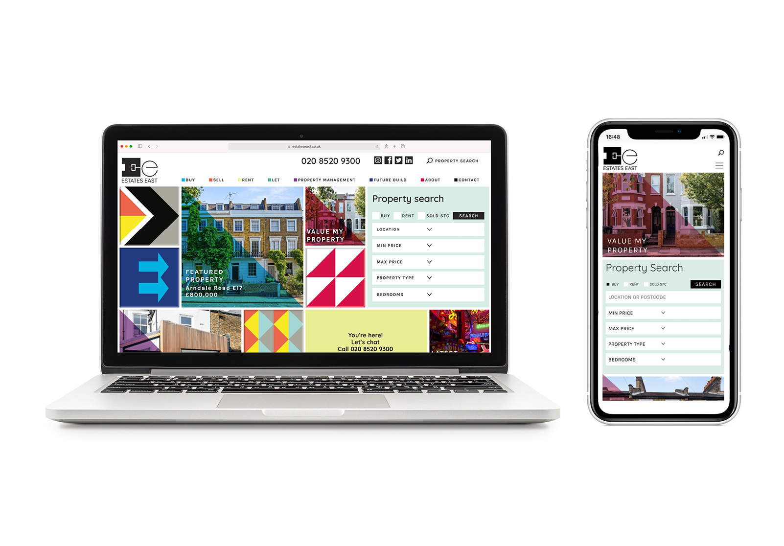
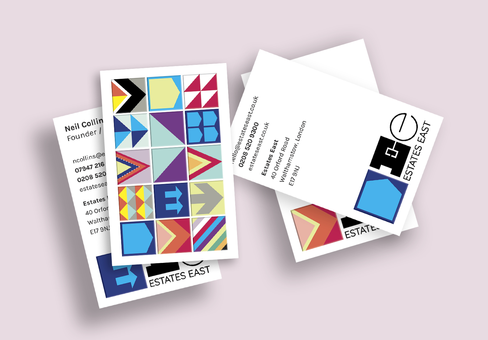
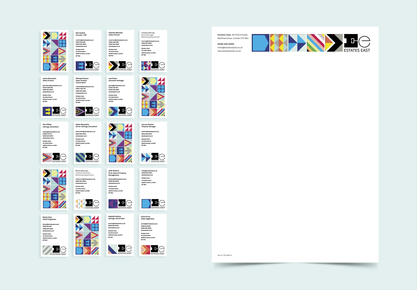
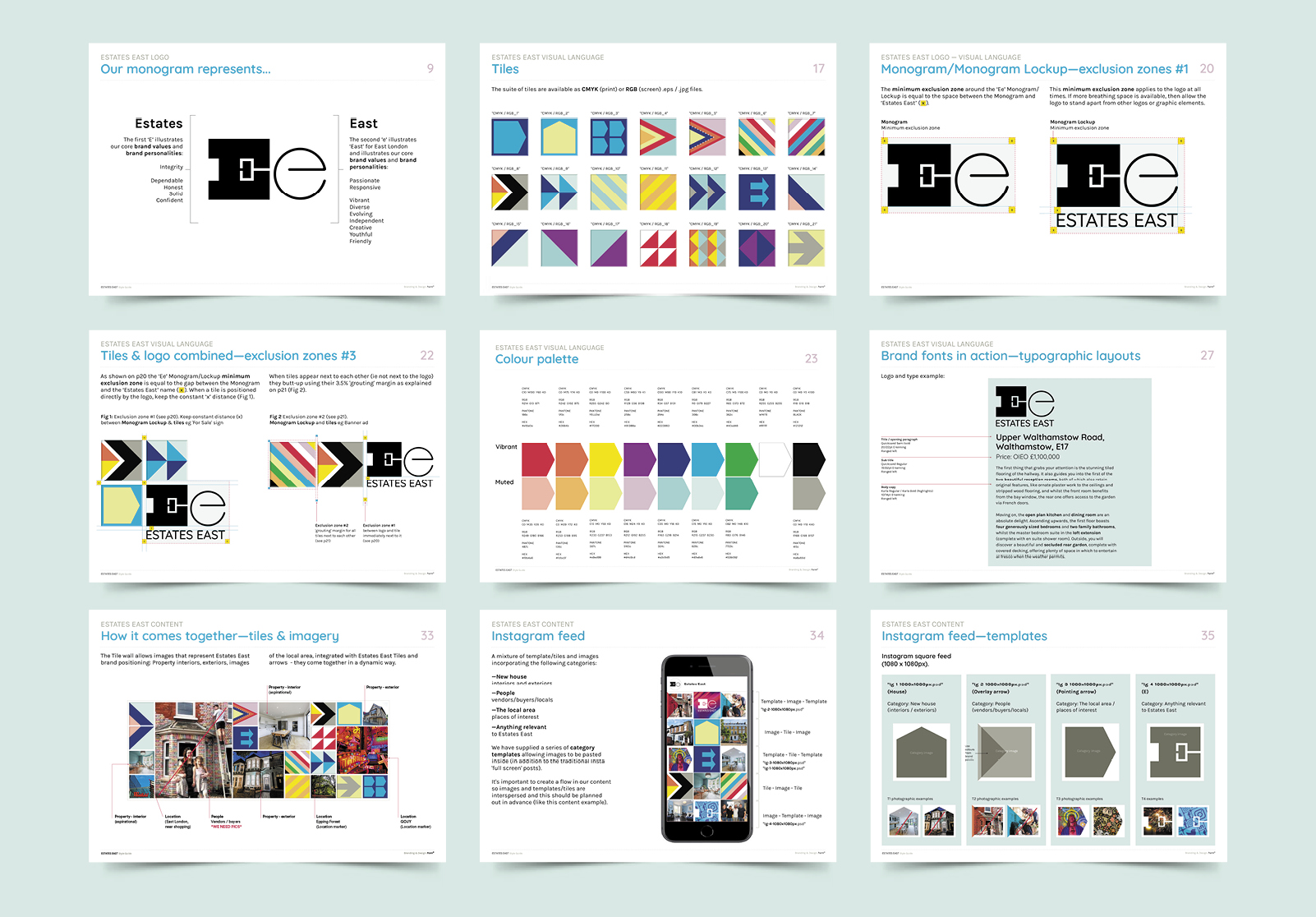
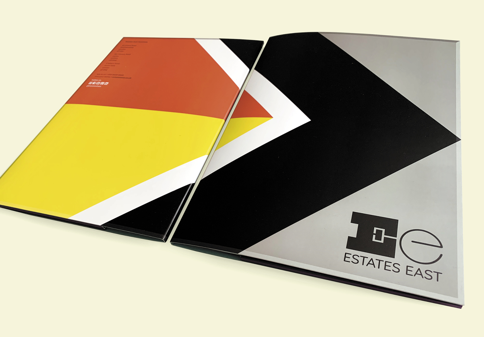
The ‘Ee’ monogram logo design features two distinct typographic elements; ‘Estates’ is represented by a bold capital ‘E’ derived from investigation of artisanal woodblocks, East-end industrial typography and traditional slab serif fonts, and illustrates the company’s dependable, confident, honest personality. The lowercase ‘e’ for ‘East’ illustrates the creative, youthful and independent spirit of east London. Once established, the logo will evolve for a Phase 2 development – the second ‘e’ will be adapted with interpretations by local east London artists affording an ongoing interplay between the blocky gravitas of the capital ‘E’ with a dynamic animated lowercase ‘e’.
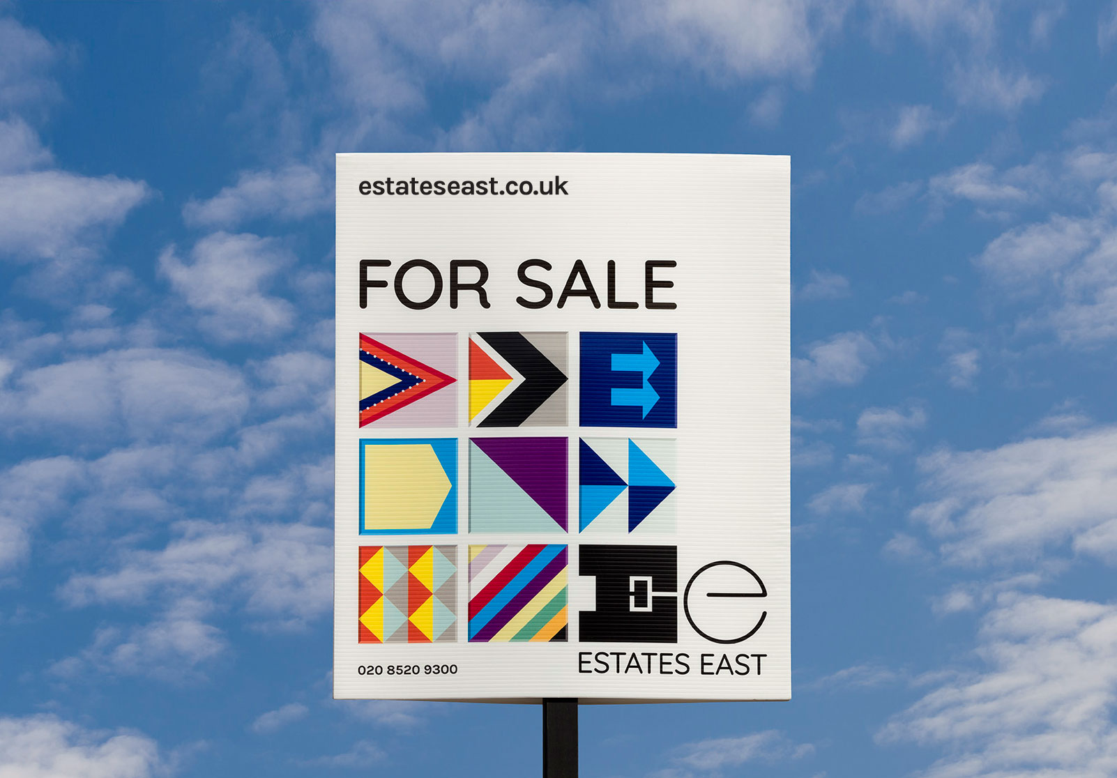
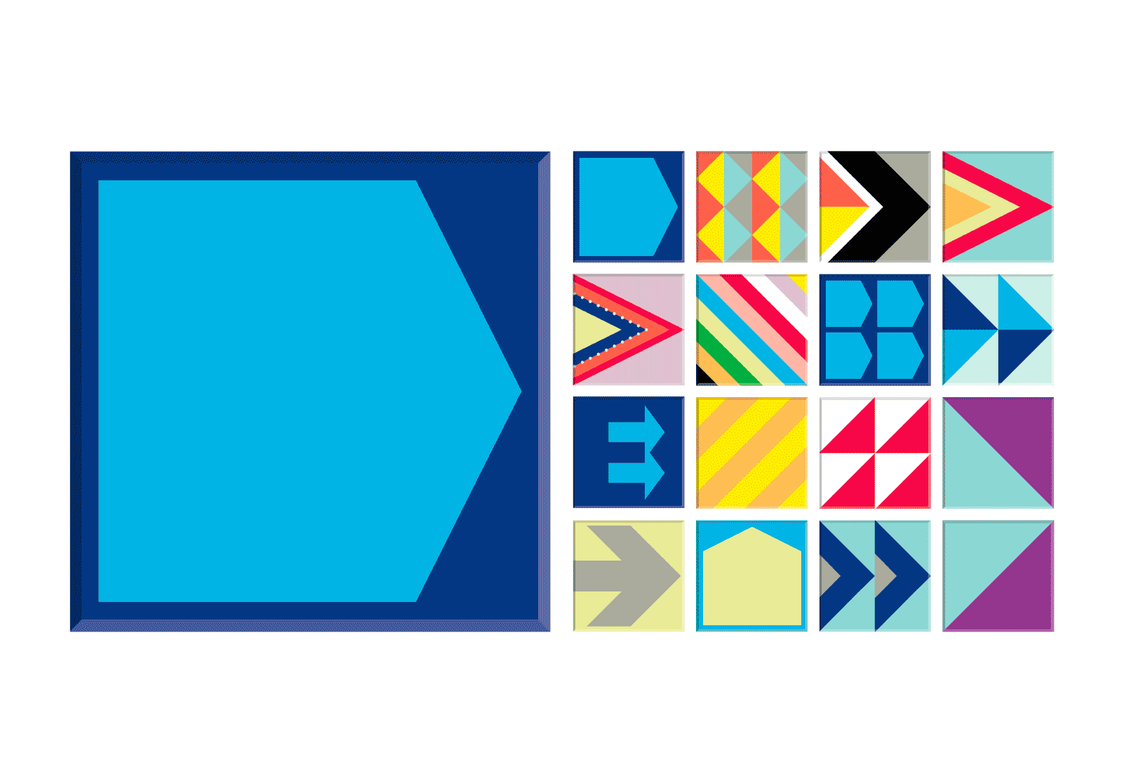
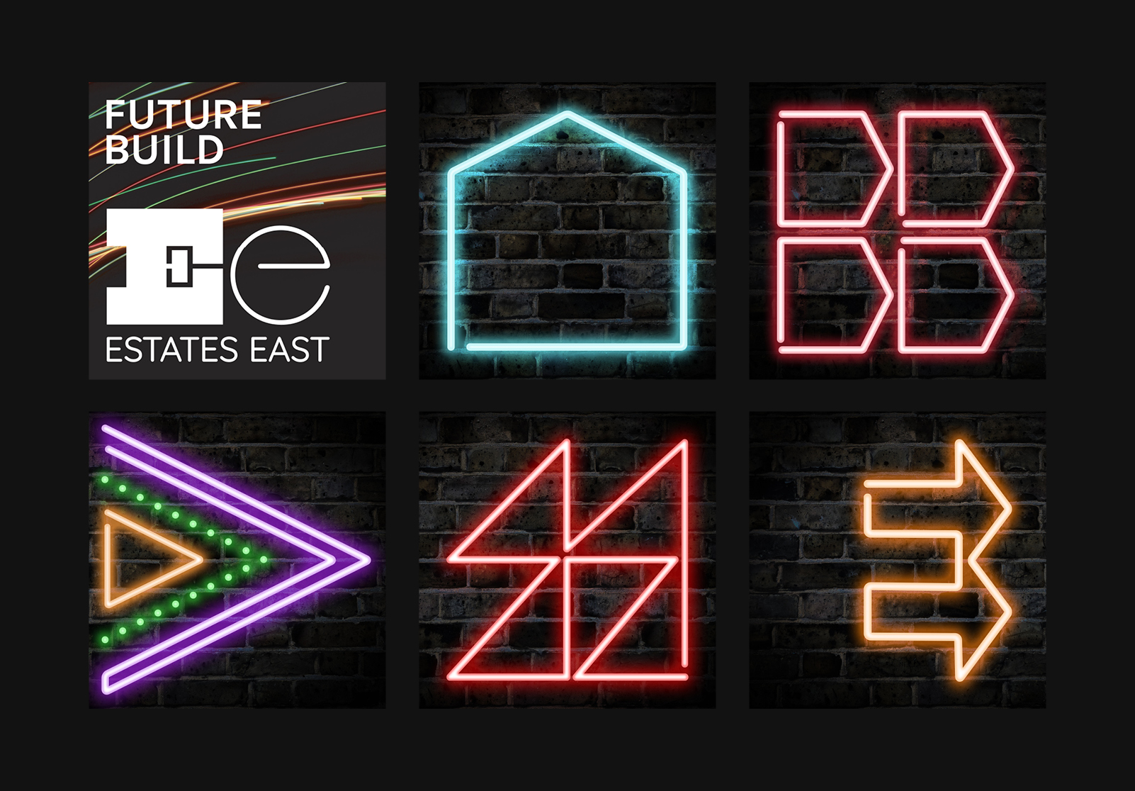
A key part of the visual identity is a suite of lively ‘tiles’ consisting of graphic symbols and arrows pointing east. This modular approach allows for the tiles to be used in various configurations such as squares or long rectangles, making for a highly flexible identity. This not only means the identity will remain fresh over time, but it is also exceptionally practical for use across a wide variety of formats, sizes and types of media.
The brand fonts are Quicksand and Karla, and the colour palette is made up of a set of vibrant and muted tones.
We also designed a suite of logos to act as figureheads for the many services and events which Estates East offer, as well as devising a strategy for social media content and template designs for Instagram, Facebook, LinkedIn, Twitter and Tik Tok.
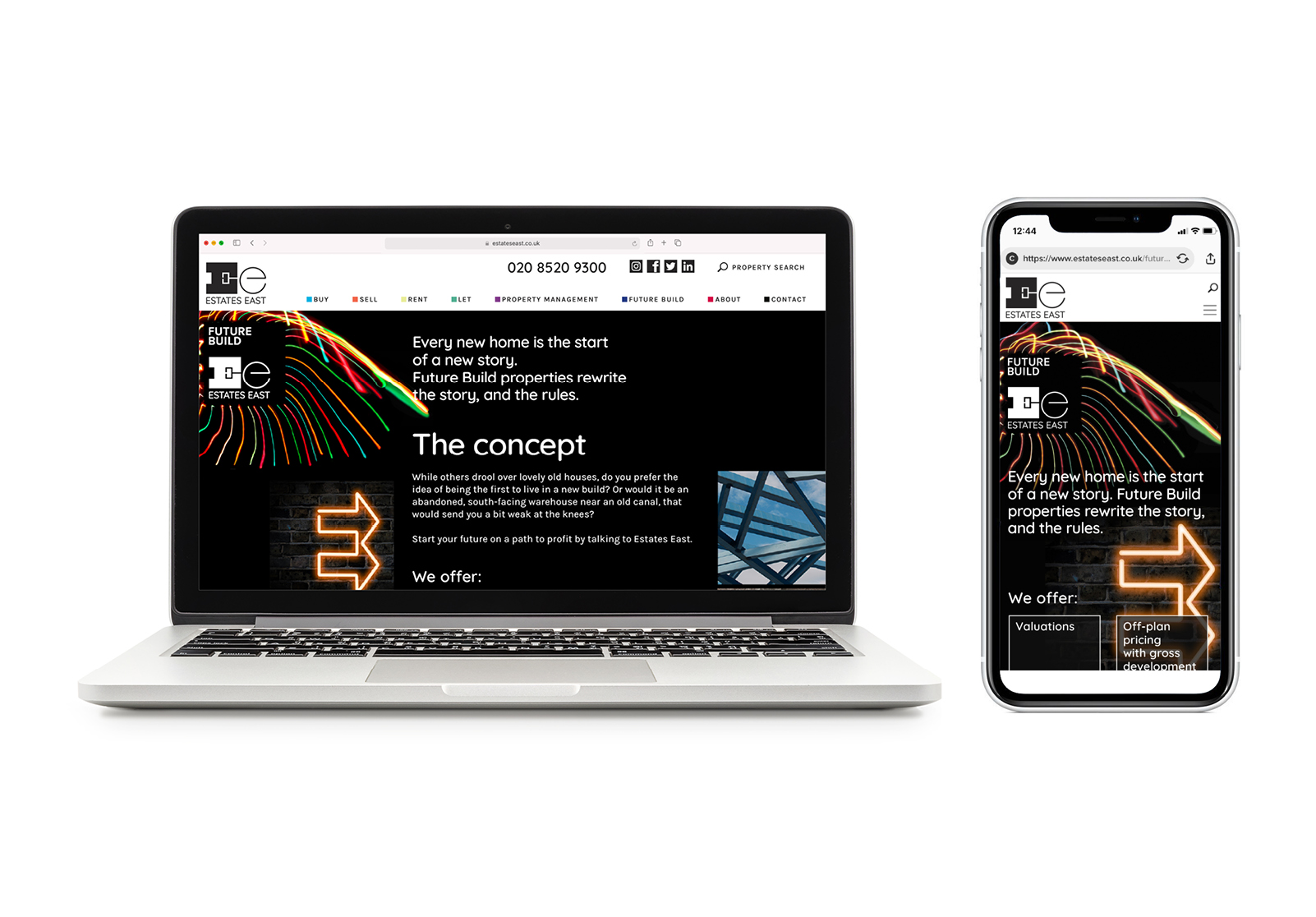
Additionally, we named and created a sub brand identity for the new homes department of Estates East: ‘Future Build’ will focus on new builds and provide in-depth advice for developers, and part of our work involved the creation of a separate style guide and web page design for this department which incorporates their reinterpretation of the parent brand’s arrow tiles – in neon.
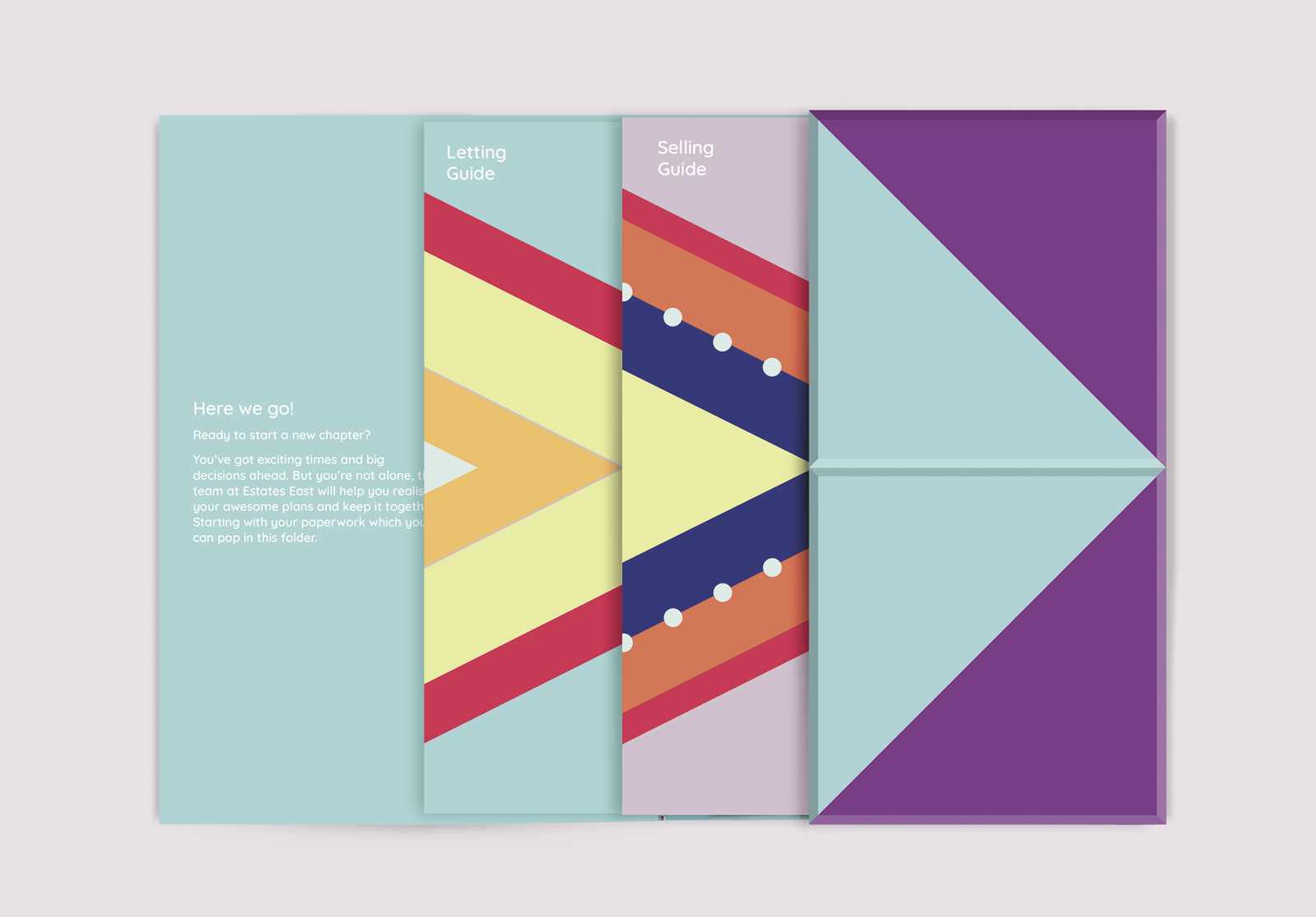
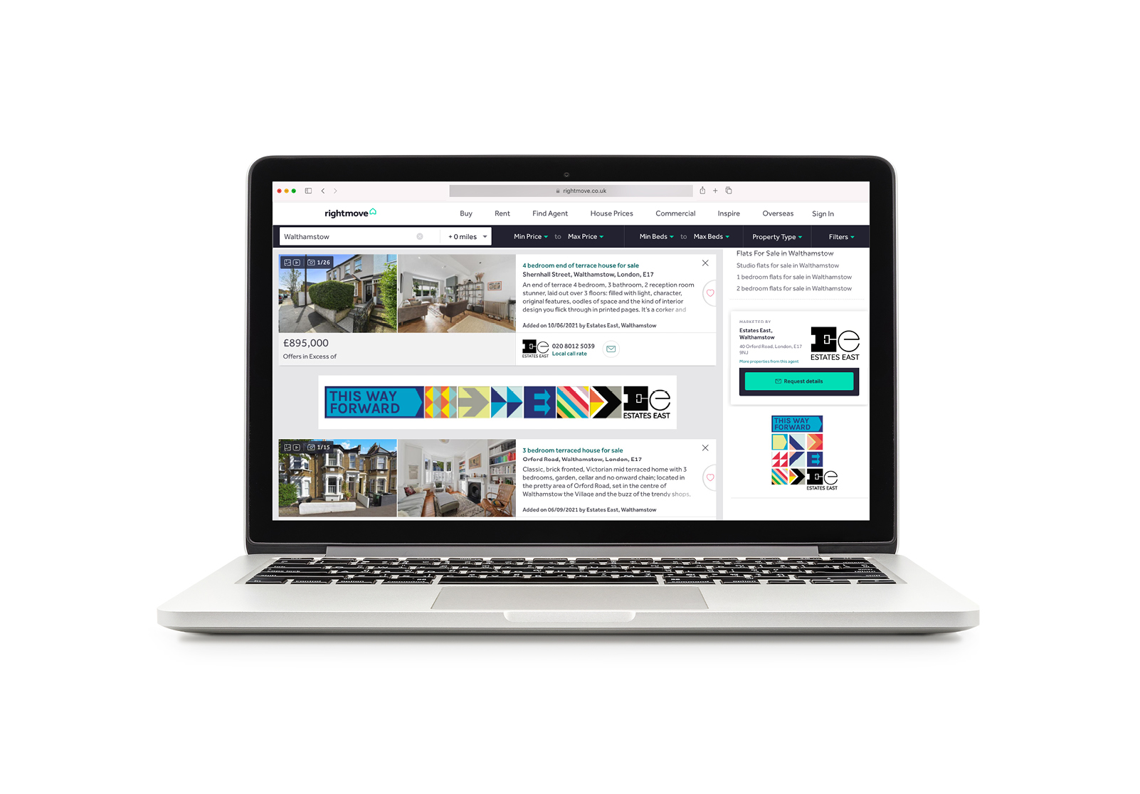
The design of two printed brochures (Selling Guide and Letting Guide) housed in a folder, the new website, property portal banner advertising, stationery for print and digital use, a set of 20 forms, For Sale/To Let boards and Out-of-home poster and billboard advertising were all part of our comprehensive brief and design work is ongoing.
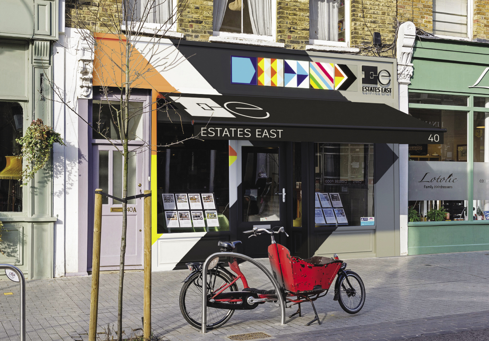
The brand was launched with a party in September 2021, in time for the peak autumn property season, at Estates East’s head office in Walthamstow which now features our eye-catching shop front design.
“It was and continues to be an amazing process working with Paula and Paul at Form®. From the initial brand bust meeting to the creation of the strong Estates East identity. At the initial meeting we knew we were dealing with a highly creative, professional, respected, and knowledgeable London art studio. Both Paula and Paul are fantastic, ‘true’ artists, with excellent organisation and presentation skills. The brand has surpassed all our expectations and has a lot of growth capabilities, and we couldn’t be happier with the result.”
Neil Collins, Founder/MD Estates East.