Ebury Publishing, the UK’s leading publisher of non-fiction books and the non-fiction specialists of Penguin Random House have just launched their new logo design, created here at Form.
Ebury Publishing is a B2B brand and is not consumer facing. However, it is important that agents, authors and booksellers get a feel for the qualities that make Ebury Publishing a unique company: Creative, Commercial and great people to work with. The brand covers a wide range of publishing. But whilst it is a corporate logo, there are many benefits in not looking too corporate – Creativity especially, is an essential quality of a 21st Century publishing house.
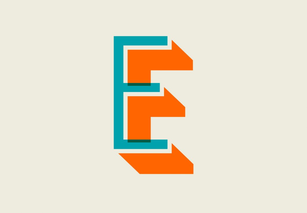
The new standalone Ebury Publishing logo design is tall, confident and reflects the brand’s positioning, taking its cues from modern crafting and maker cultures and lifestyles – which in turn take their cues from the revival of traditional practices, such as letterpress and screen printing.
The new capital ‘E’ of the Ebury logo has been developed with an ‘overprint’ effect between the letter and the drop shadow – an ‘imperfection’ which is embraced in the spirit of Creativity.
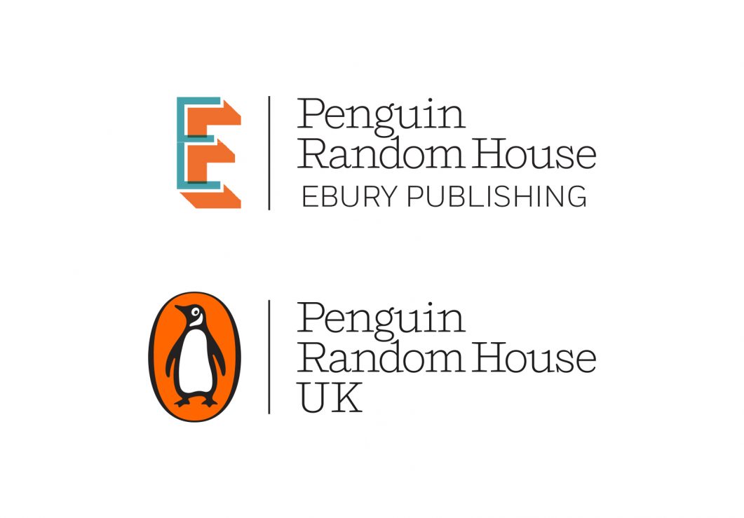
Importantly, the new logo has been created to work in harmony with the Penguin Random House parent brand. The logos occupy similar physical space and now share the same Penguin orange colour. The ‘E’ logo orange is complimented by a fresh and vibrant teal blue.
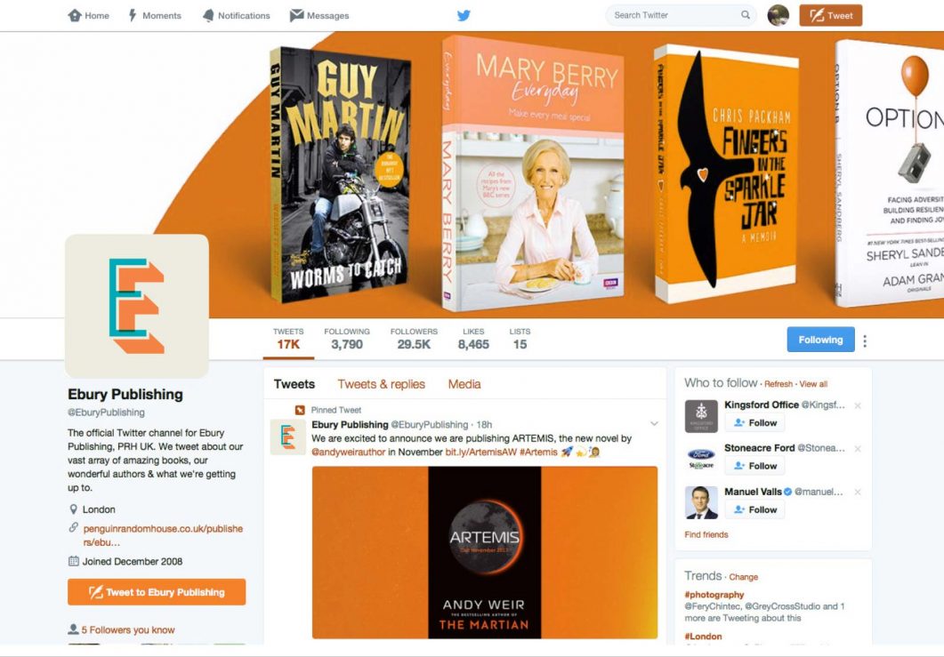
The new logo will be rolled out across all marketing communications, social media feeds, website and stationery – all following the style guide we have also created.
The Ebury logo redesign has been featured in The Bookseller, Design Week, Transform, Logo Designer and Creativepool.